


MAPODEPOT CULTURAL CENTER
Type: Cultural
Location: Seoul, Korea
Size: 54,000 SF indoor + 22 acres outdoor
Design: 2014
Project Architect: Marcelo Ertorteguy
MEP/Sustainability: Arup
Structure: Silman
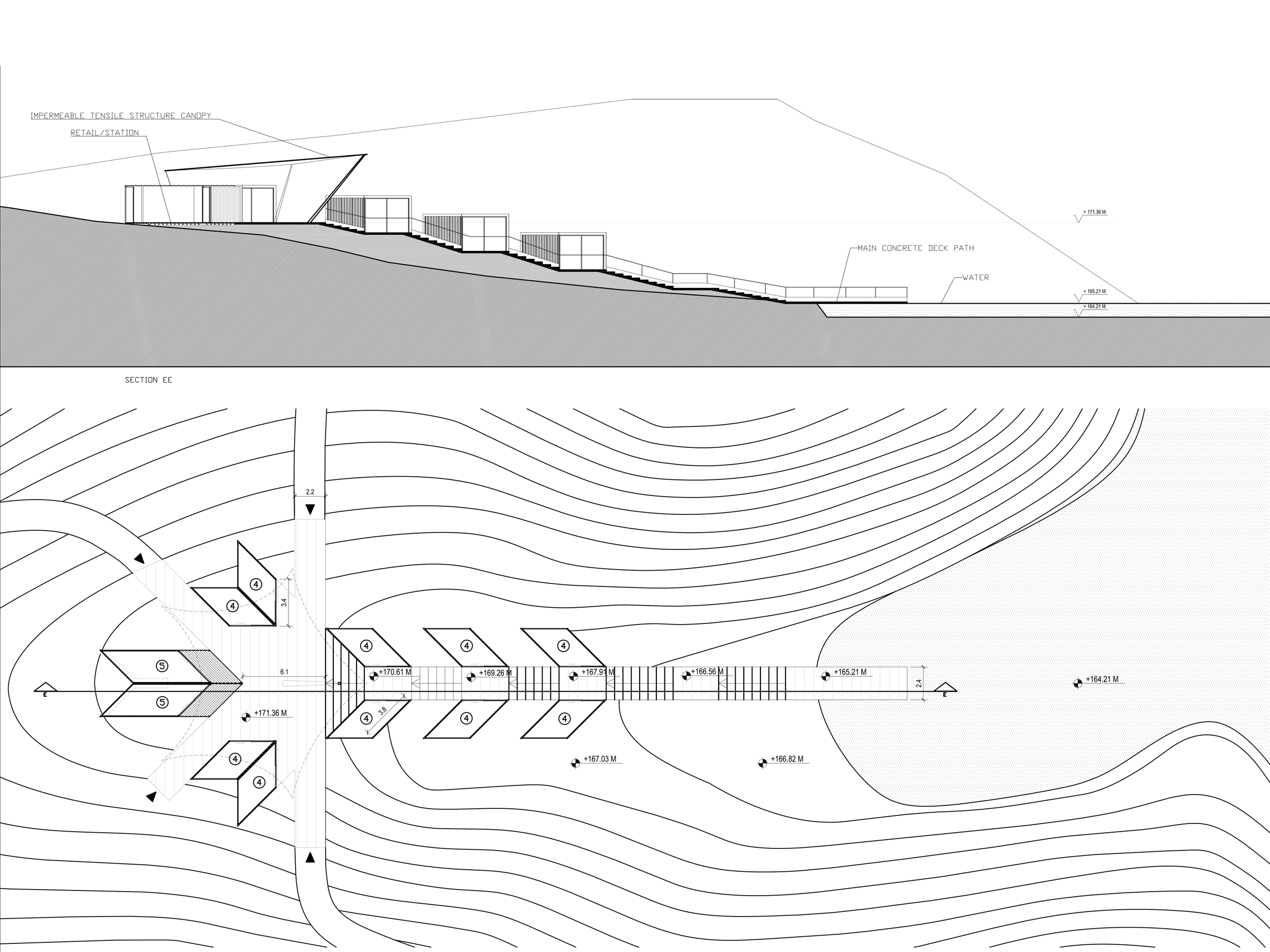
Two straight axes are cut into the ridged topography and through the top of 4 of the tanks forming a long cross (yellow) that becomes the main mark on the territory as well as the main circulation system. The two cuts connect all the tanks and continue into the surrounding landscape, climbing the rocky craters and connecting to the existing trails at the crest of the hill where visitors can enjoy city-wide views.
The existing gravel road around the parking lot is partially retraced as two overlapping circles. The two circles combined are used as Vehicular Access Road, while the western circle functions as a shorter Pedestrian Access Loop from the parking to the upper area of the park and tanks. This loop surrounds a phytoremediation area for the water used in the park and a large three-dimensional sculptural sign that spells out the word MAPO as an icon of the whole complex.
Two shorter inclined paths – partially cut into the topography - connect the two largest tanks to the Pedestrian Access Loop and Vehicular Access Road. Along the pedestrian loop visitors encounter these two entry paths cut into the topography and slowly discover the tanks as they ascend along these sloping paths. The slow emergence of the tanks from the landscape keeps a level of surprise to the experience of the place.
Sections of the moat around each tank are filled with dirt, burying selected areas of each tank. The top of each dirt infill is a new landscape shaped as the expansion of the circular form of the tanks that reverberates into the existing geography.
The landscaping of these green areas is conceived as gentler, flatter, more welcoming area in contrast with the impervious rocky landscape of the site, and it is directly connected to the program housed within each tank as a natural outdoor expansion of that interior function. Visitors can engage in outdoor activities or just linger here and enjoy the space for outdoor relaxation.
A continuous S~shaped path connects the new green areas around the tanks, crossing the main axes at a higher elevation. This wondrous path runs along the top or medium rim of the landscape craters in which the tanks are sunken, providing a fantastic vantage point to see and experience the top of the tanks and the park at large. By night a dotted line of lights marks the path within the landscape.
Architecture and Program
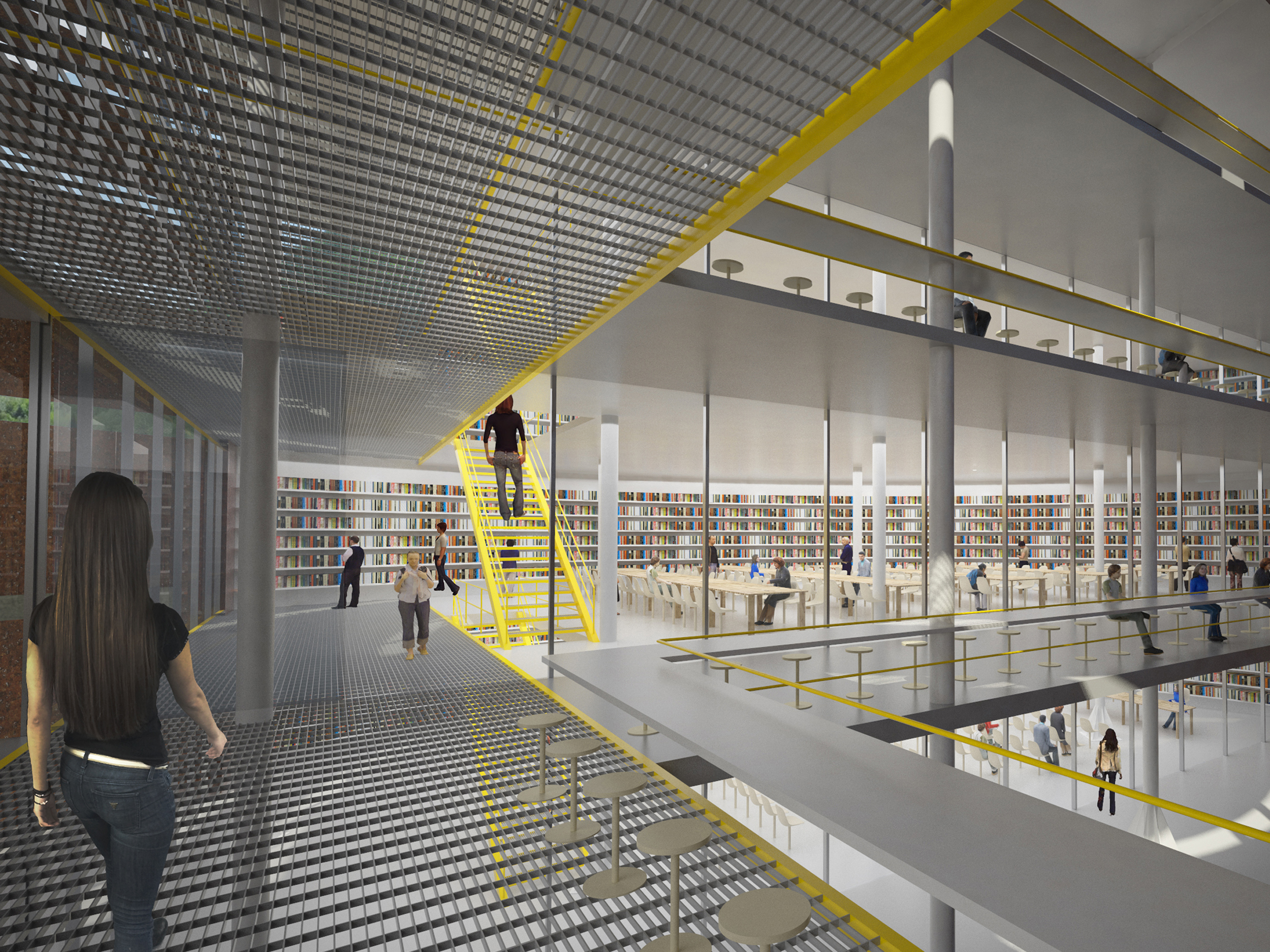
Our proposal for the reuse of the MAPO tanks is based on UPCYCLING strategies that respect and enhance their archeological nature and at the same time forcefully re-interpret them to transform them into a cultural center. We also aim at keeping portions of the tanks totally unadulterated to take advantage of their visual history through the proportions of their interior spaces, their structural details and their patina layers. Our intention is to contrast these intense aesthetics with new interventions that apply industrial and minimal finishes to insert the required program within the tanks. A series of operations applied to all tanks bring the abstract geometries used at the landscape scale into the architecture scale, through the straight cuts of the main circulation axes and the concentric circular pattern centered on each tank:
-
The main circulation axes mark a precise border within each tank between enclosed/conditioned space and open/unconditioned space. This aims at satisfying multiple intentions: a) keep part of each tank "as is" and be able to experience in each tank the "tank-ness" of the tank; its raw materials, structural system, original proportions/height and overall atmosphere; b) enclose and condition only a portion of the tank to concentrate and reduce construction efforts as well as energy consumption; c) use the non-conditioned space as open atrium with visual connections and strong light/shadow atmosphere as well as a buffer zone that filters light and generates a micro climate; d) experience continuously the contrast between new and archeological, between raw/rusted and finished/painted, between inside and outside.
-
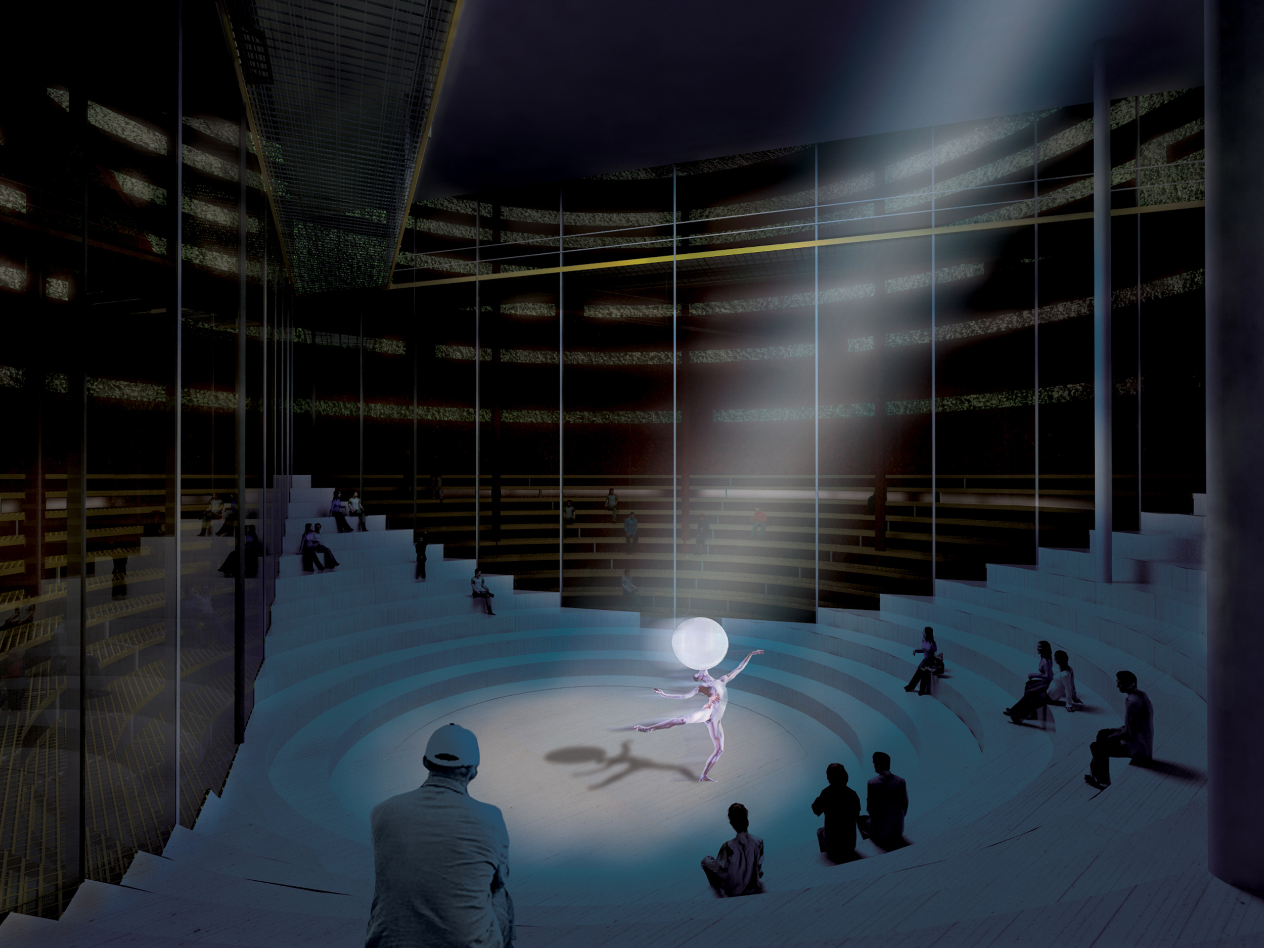
The metal wall of the tanks’ unconditioned areas is perforated with long slots that start in a concentric circular pattern on the roof and continues in a parallel gradient on the vertical walls. The slots open up the tanks to the outside views, bring sunlight in with a strong play of shadows during the day, while at night push interior artificial light out to the landscape acting as large lampshades. The outside of each tank is painted silver only in the unconditioned sectors, generating a strong graphic contrast with the opposite sectors which are left as is with faded paint and rust patina. Slotted pattern and paint align with the edge of the main circulation paths, contributing to the general geometric definition of MAPO.
-
The edge between conditioned and non-conditioned space inside the tanks is defined by a glass wall which guarantees visual continuity between the two spaces and enhance their contrasting nature.
-
The bottom of the unconditioned space in every tank is flooded with about 30cm of water to symbolize the oil that used to be contained in the tanks and to generate interesting reflections within these open atriums.
-
The main circulation axes run through the top of each tank creating a barrier-free accessible path throughout the complex.
- Stairs are located along the main circulation within the conditioned space while glass-box elevators are placed along the main axes within the unconditioned space for visitors to experience the verticality of the undivided raw space of the tank
Starting from these common criteria, the architecture of each tank is further developed according to the specificity of each program:
- HVAC Plant
- Information Center
-
Performance Space;
-
Temporary Exhibitions;
-
Permanent Exhibition.


QIYUN MOUNTAIN CAMP
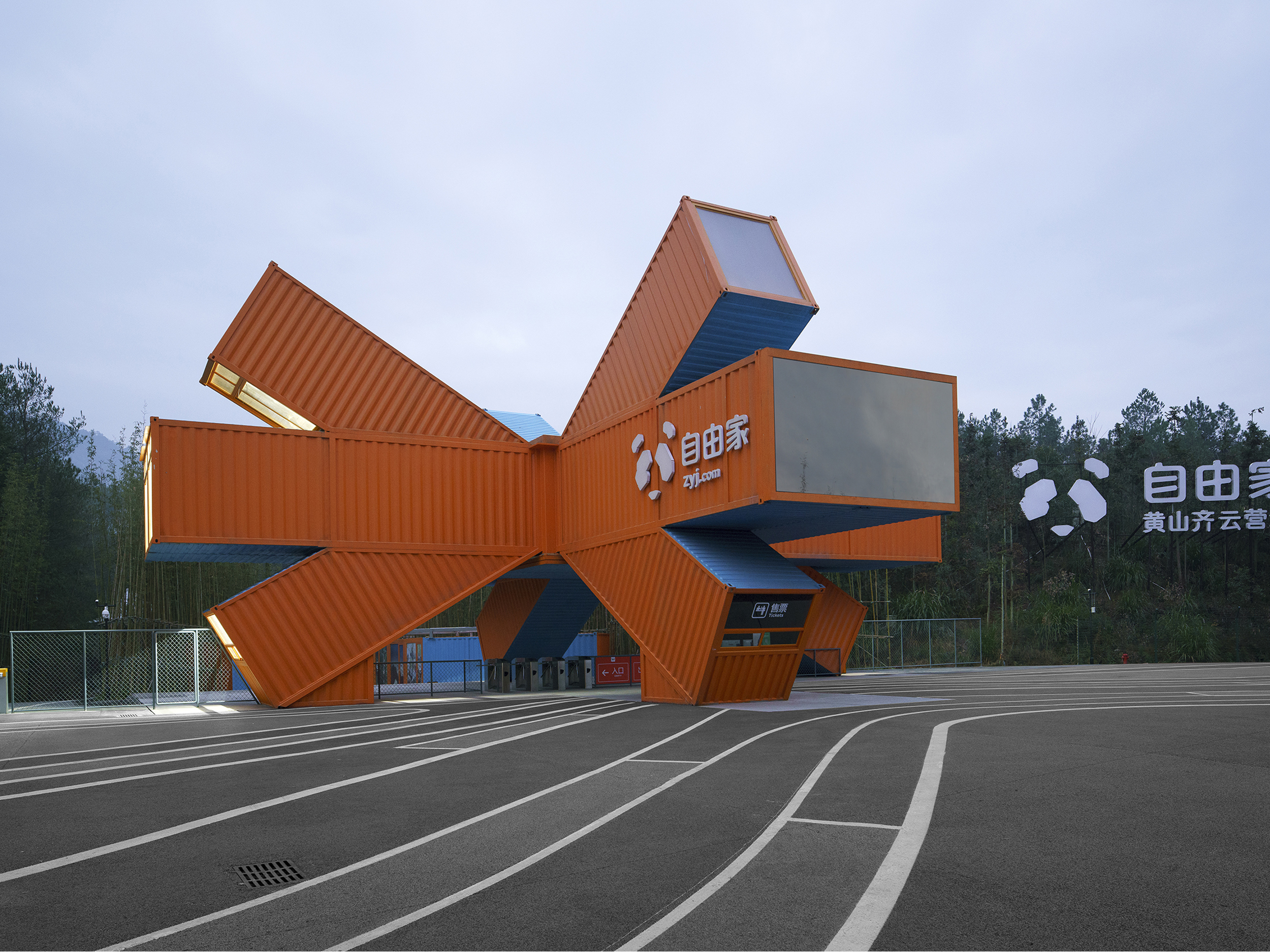
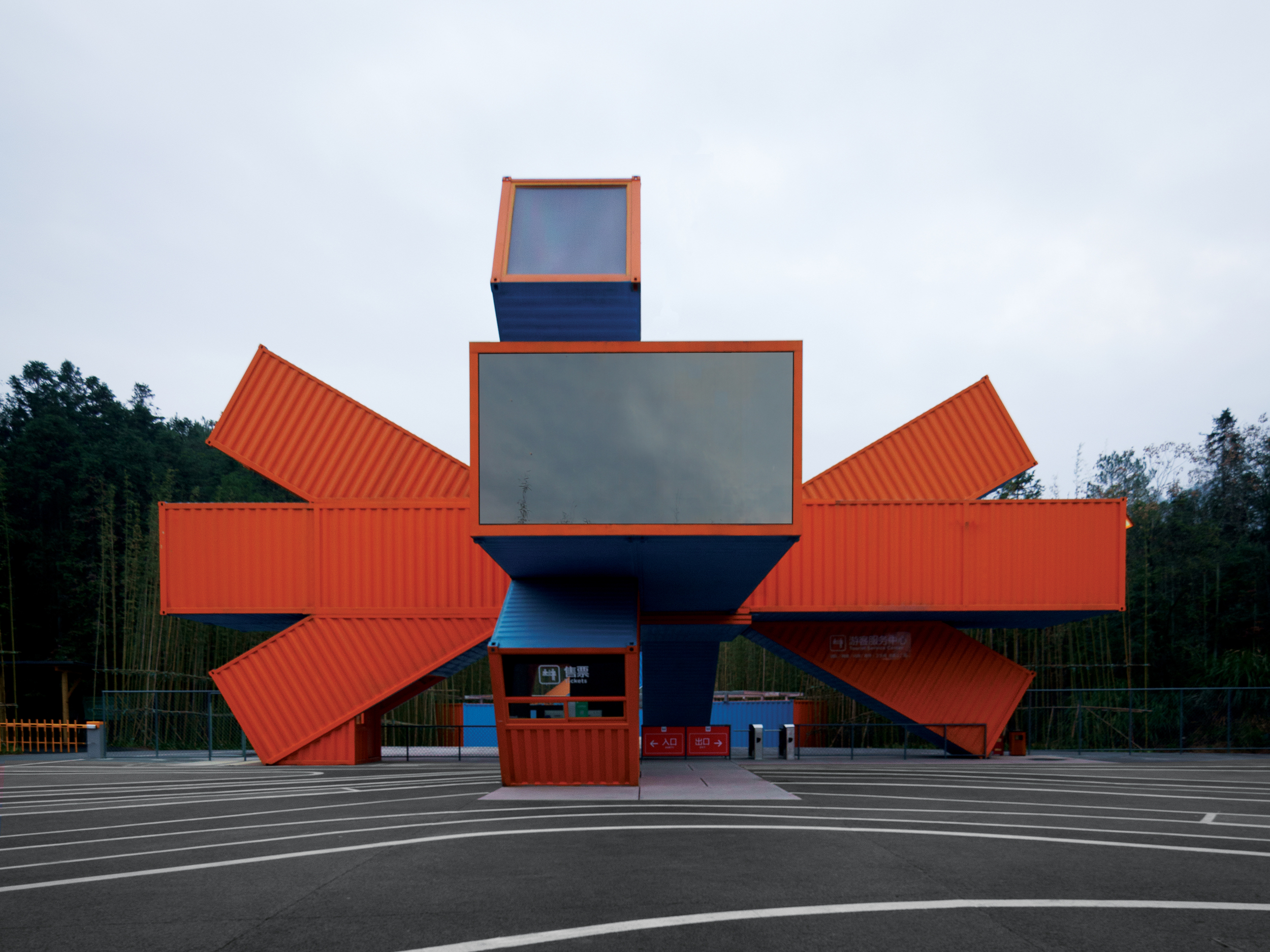
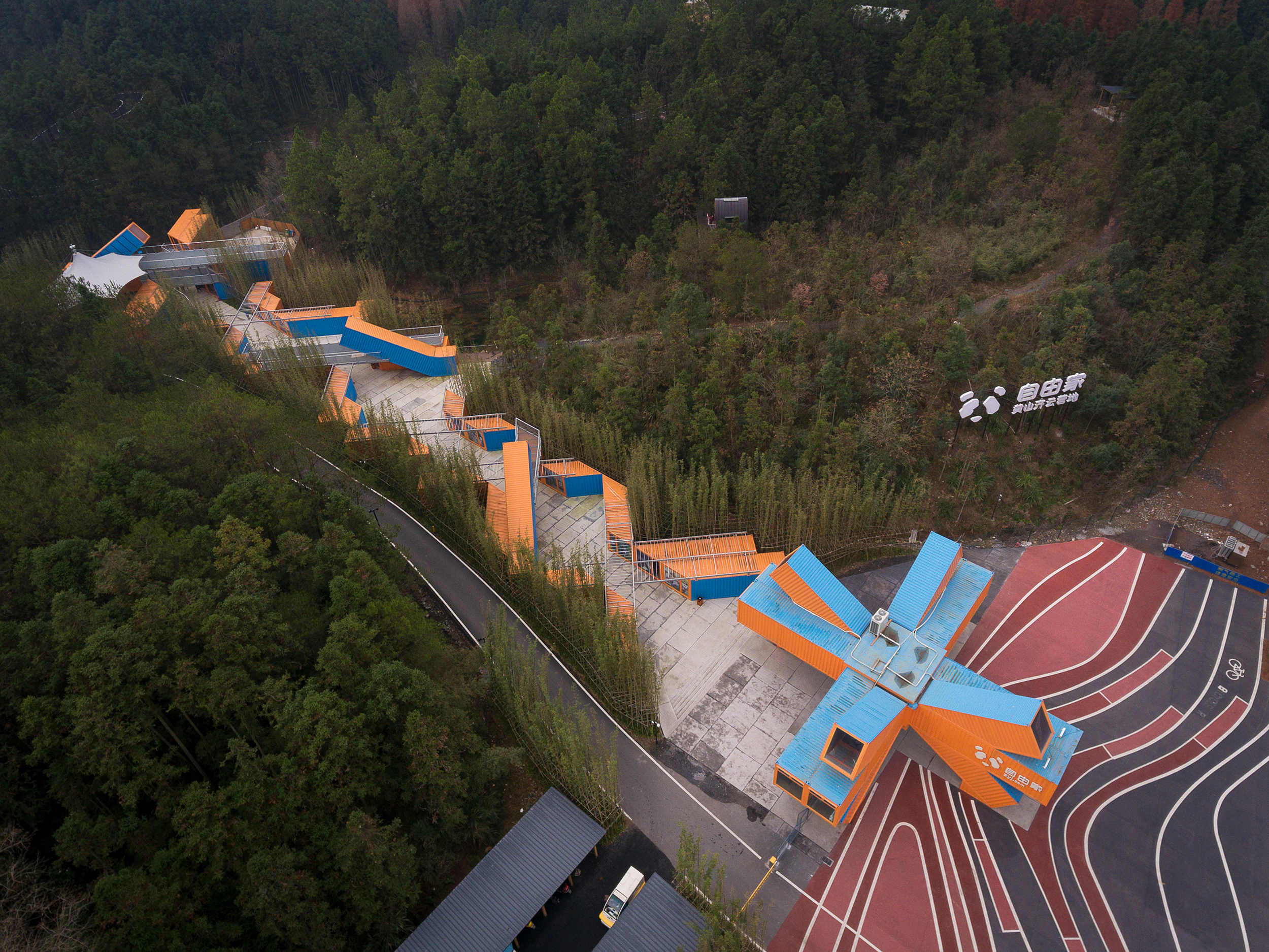
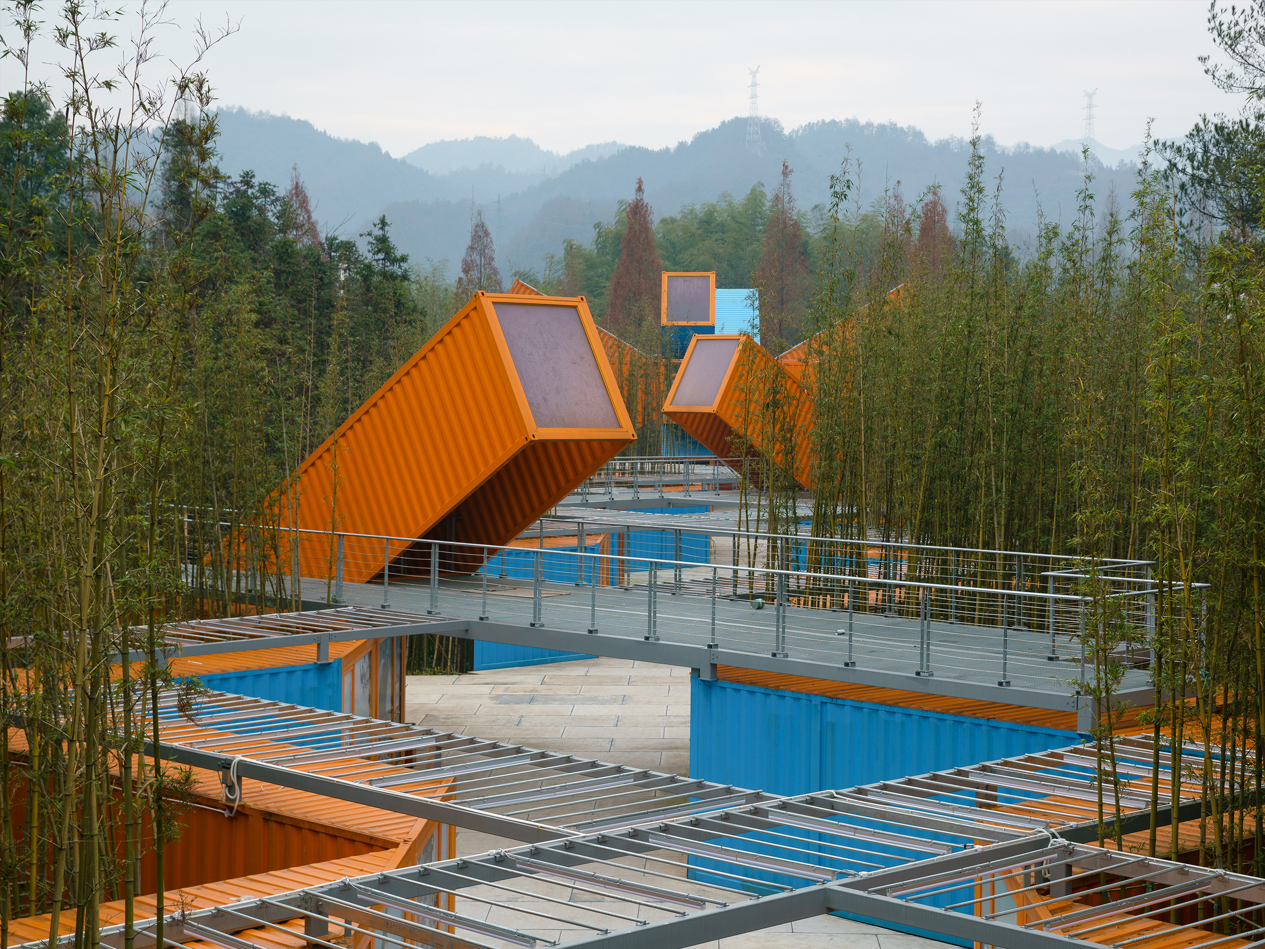
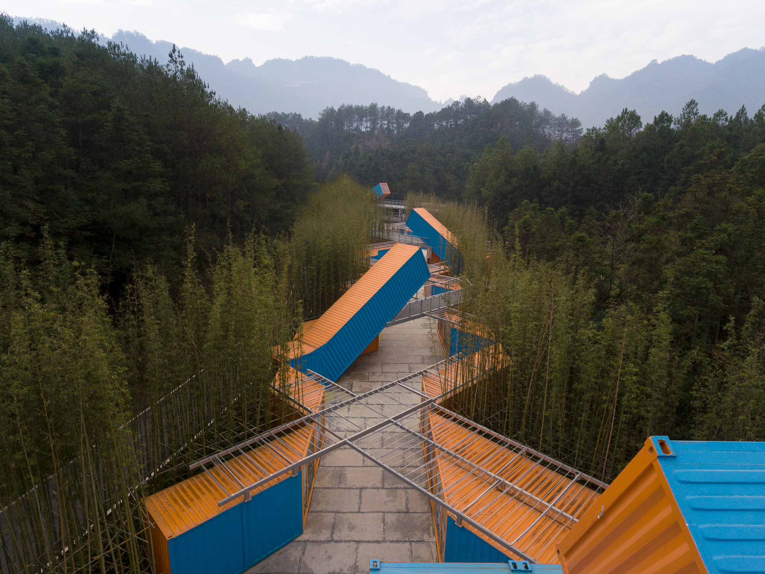
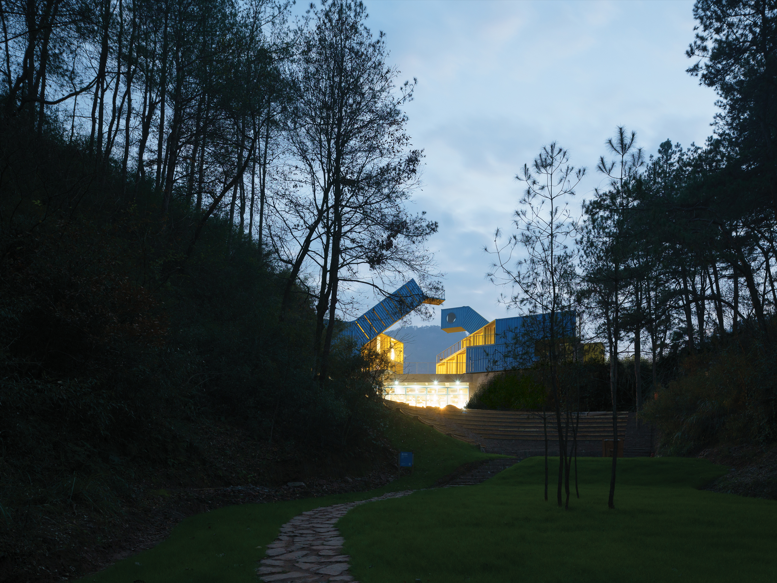
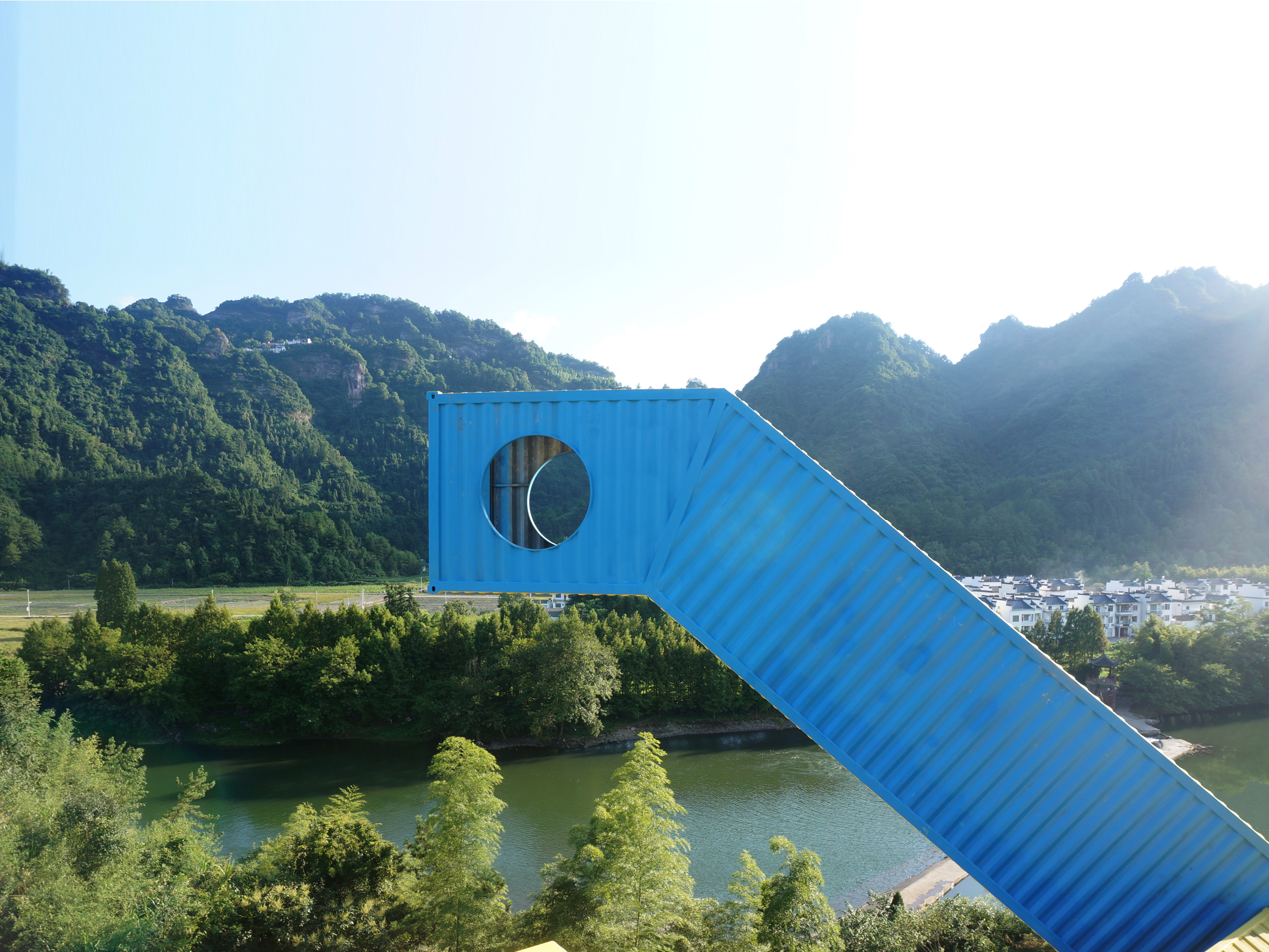
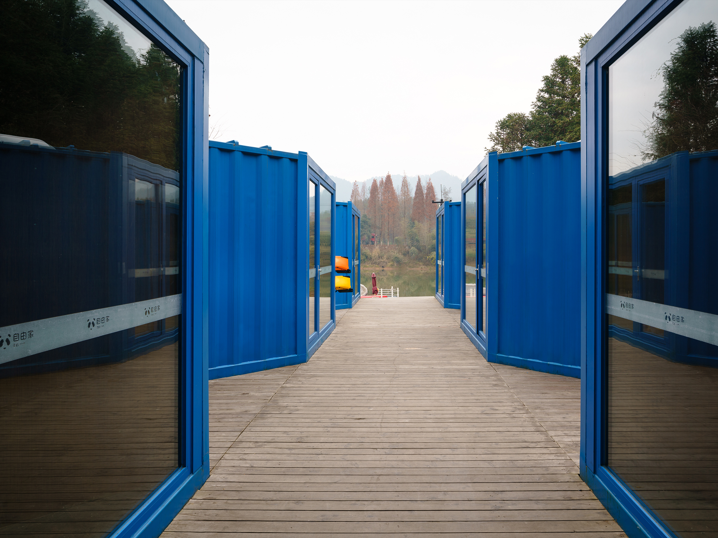
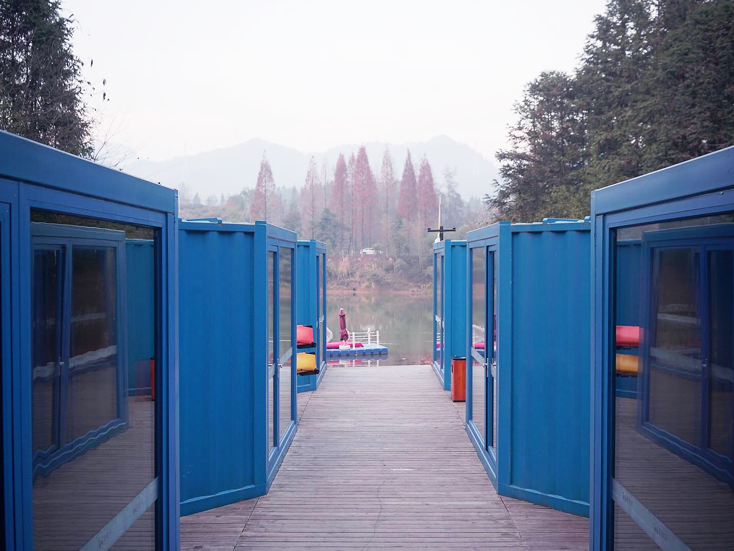
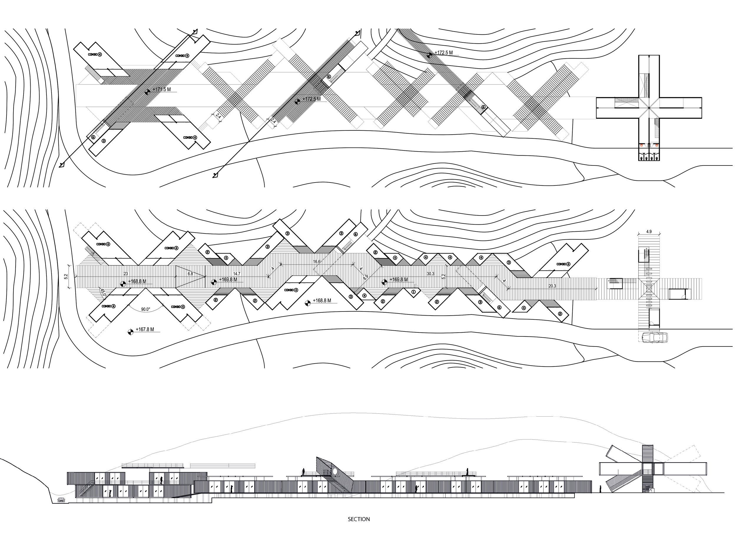
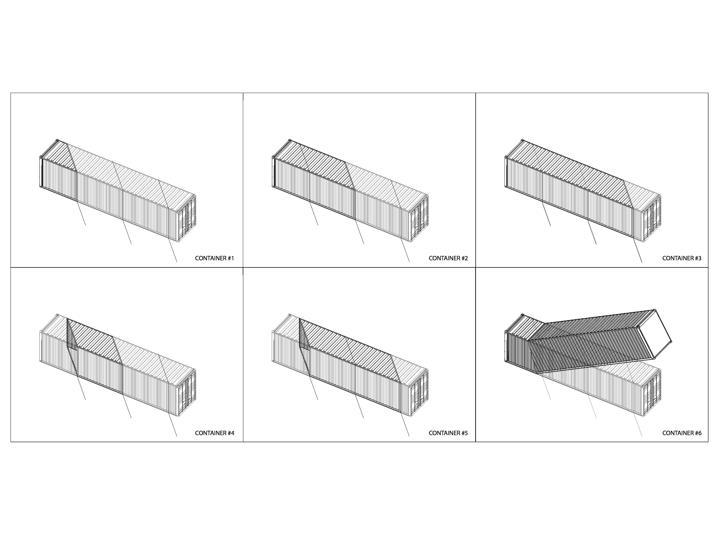
The Qiyun Mountain Camp is a natural adventure and extreme sports park located near Qiyun Mountain, a sacred site known as the birthplace of Taoism and the yin-yang symbol. Designed to blend into the pristine natural surroundings, the park's public service buildings are constructed from repurposed shipping containers, cut and reconfigured to create versatile, functional spaces.
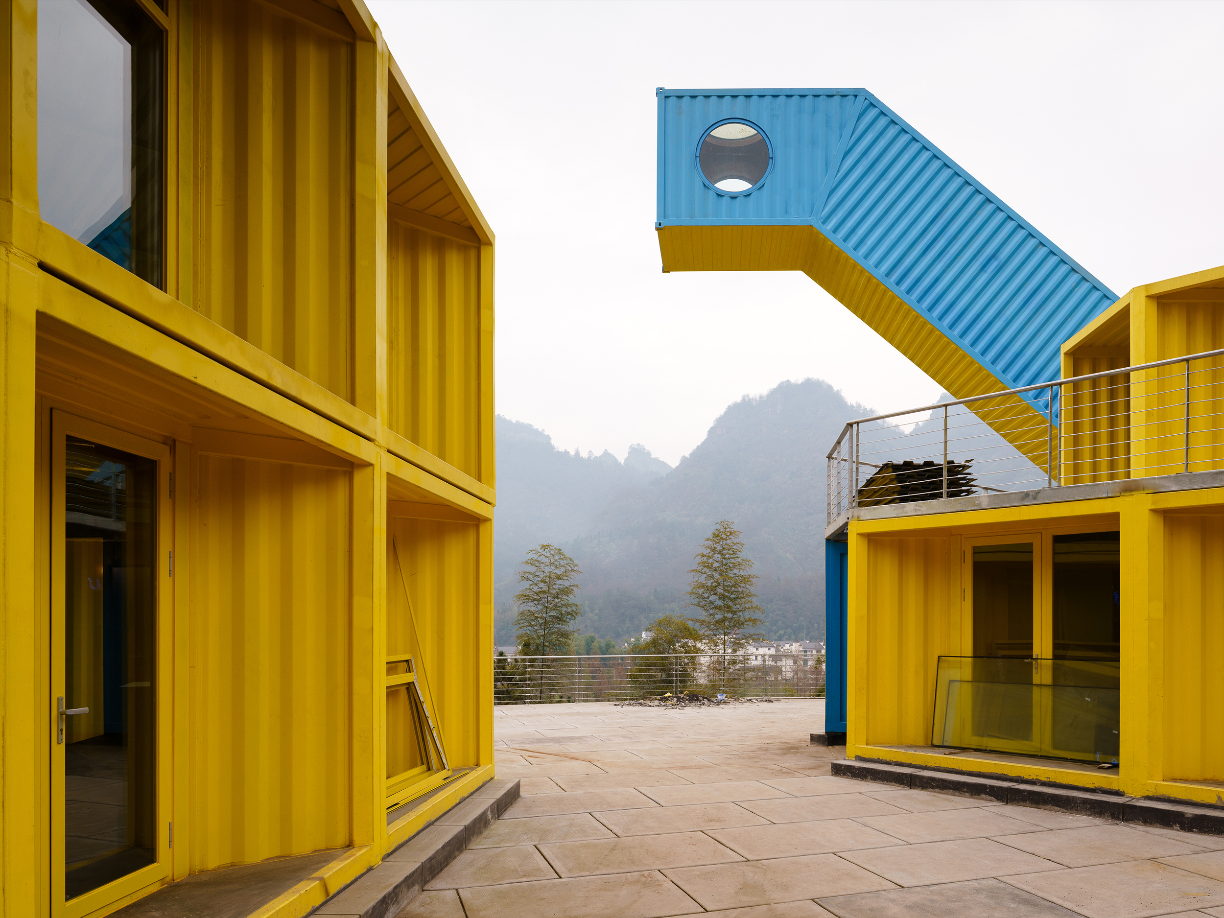
The containers are joined, mirrored, tilted, and combined in innovative ways to suit various programs, forming unique architectural typologies. The park is organized into three distinct, color-coded areas, carefully integrated into the landscape to respect the varying topography and provide clear landmarks within the natural setting.
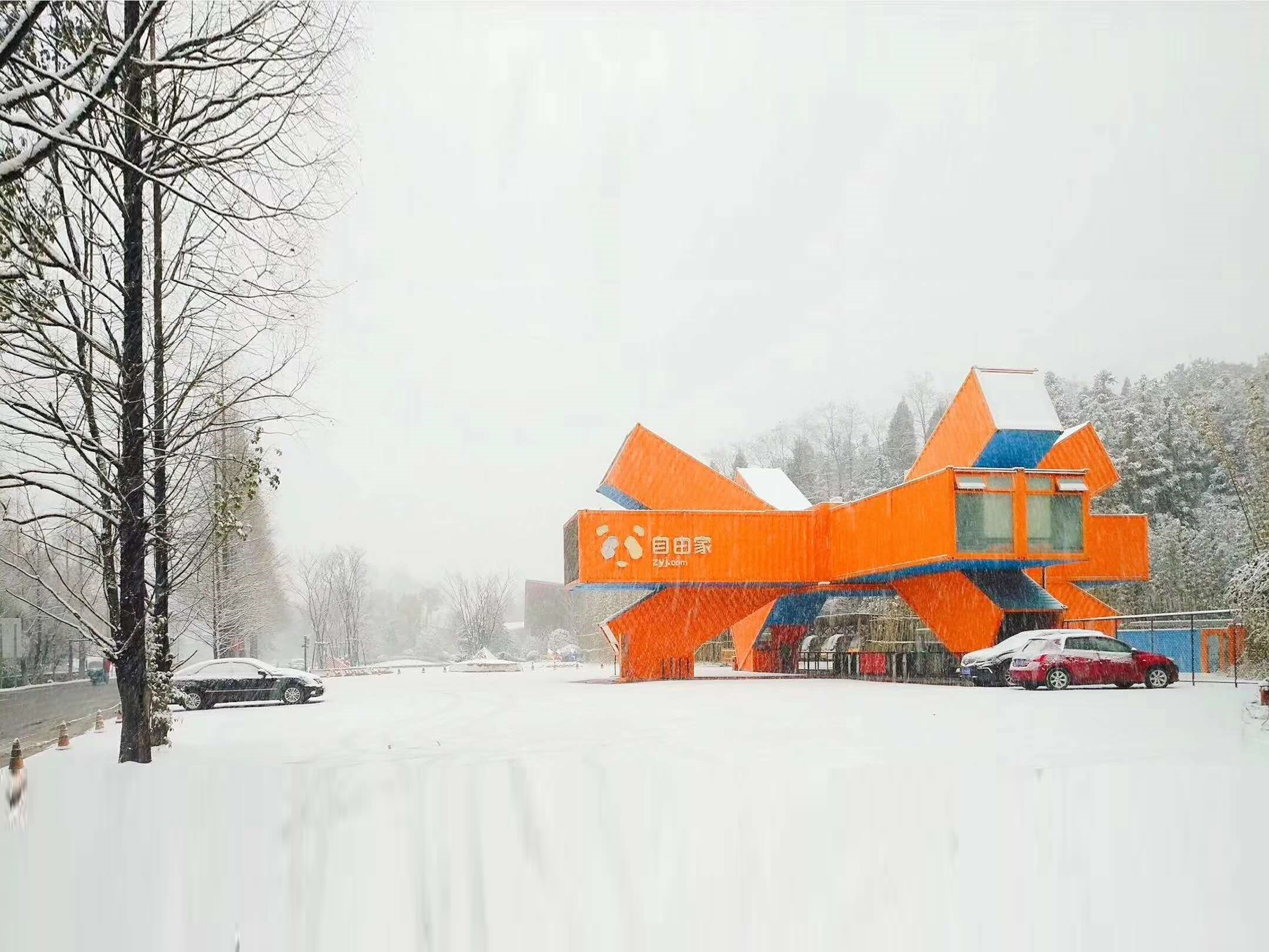
- Orange and Blue: Entrance Area
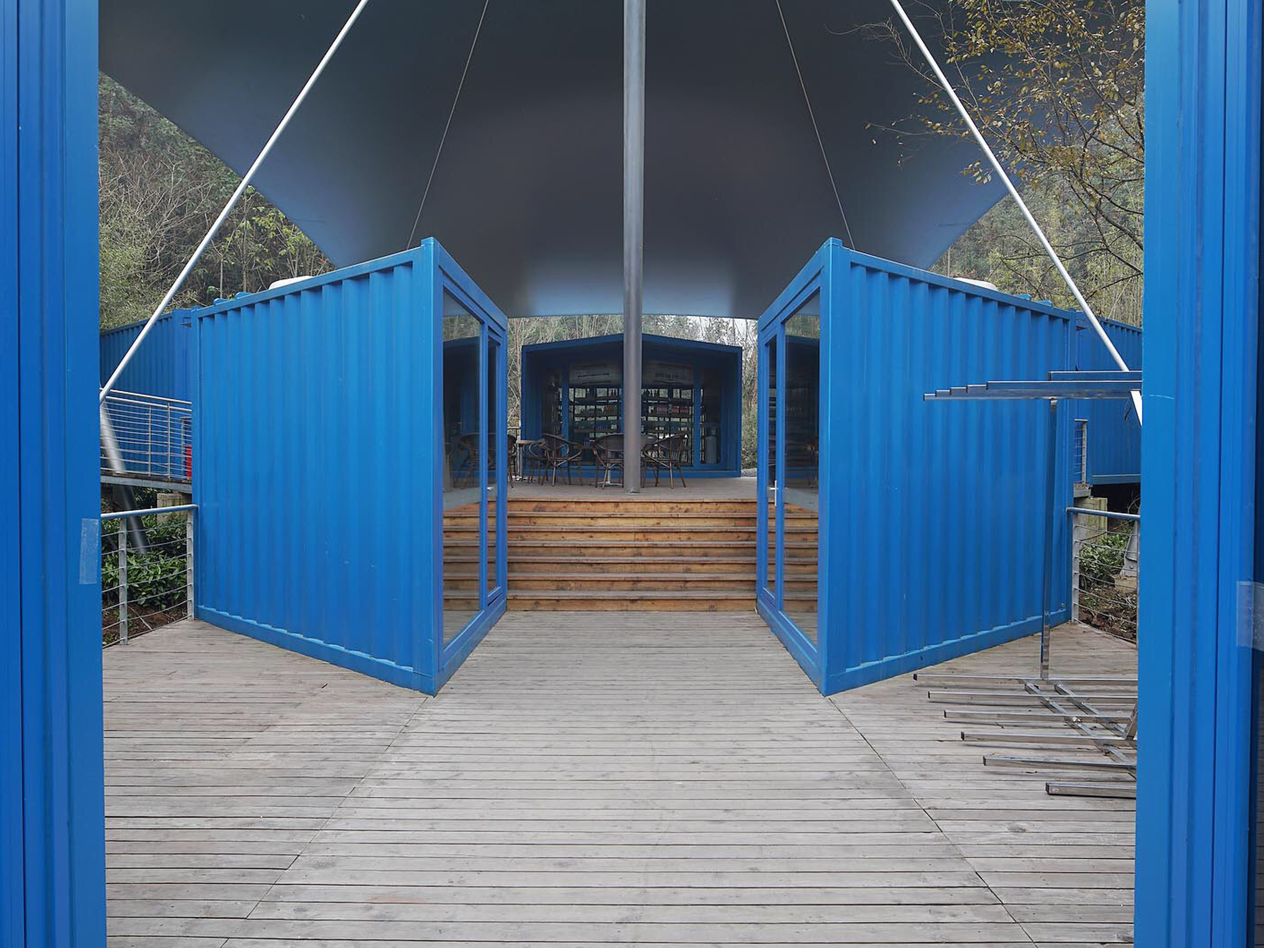
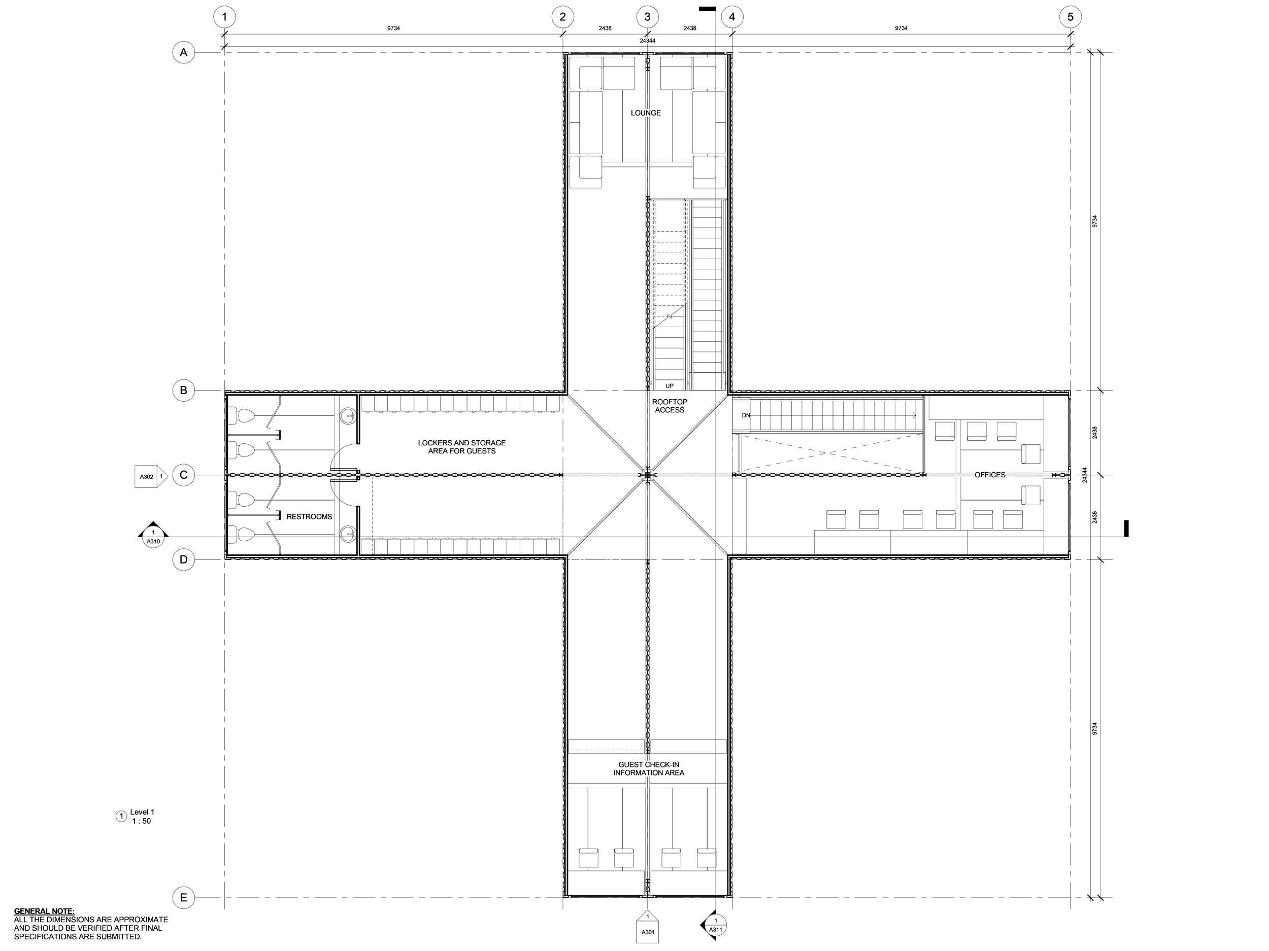
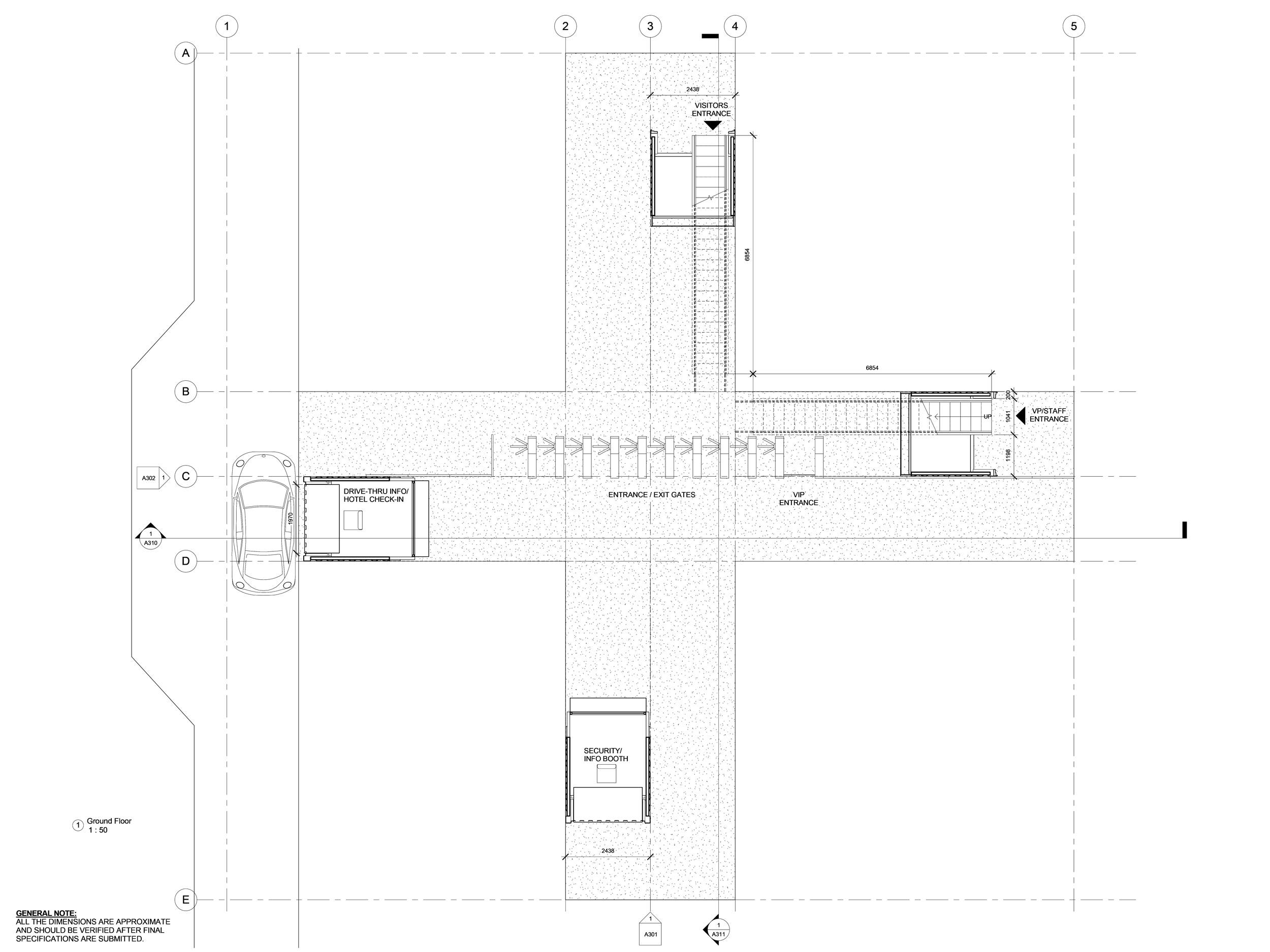
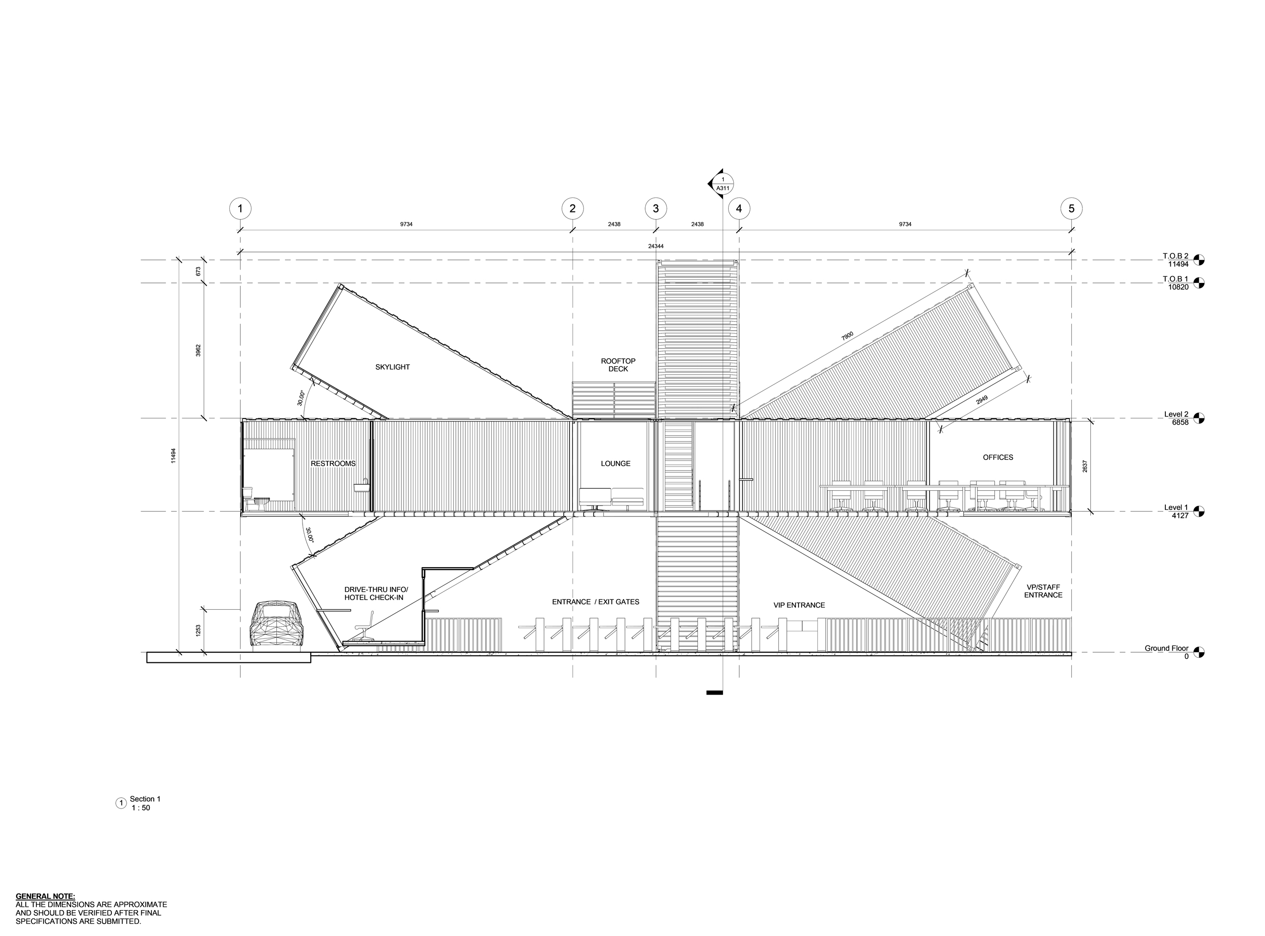
This area includes the Entrance Pavilion, a two-level structure housing turnstiles, offices, a ticket area, and an information center. Visible from the main roadway, it provides access to Market Street, which features shops, cafes, service areas, and restrooms. With pergolas, double levels, and upper decks, Market Street connects seamlessly to the surrounding landscape. - Yellow and Blue: Restaurant Plaza
Located on one of the park’s hills, this area offers indoor dining and an outdoor terrace overlooking the river. It slopes downward into an open amphitheater, providing a social space that connects visitors to the park. A tilted container serves as a zip-line lunch platform, adding a playful, functional element. - Blue: Aquatic Pier
Positioned by the lake, the Aquatic Pier provides access to water activities. Modular units cluster around shaded areas with changing rooms and cafes, offering storage for kayaks and guiding visitors to the floating pier, which stretches into the lake for water sports.
The Qiyun Mountain Camp uses bold, functional design to create a harmonious relationship between architecture and nature, offering visitors an immersive experience that celebrates the site's sacred and adventurous spirit.
RESTAURANT PLAZA


AQUATIC PIER


MAP + DRAWINGS


ENTRANCE AREA BUILDING PROCESS
Credits
Client: ZYJ Sunriver, ChinaType: Entrance Pavilion, Market Street, Restaurant Plaza, Acquatic Sports Pier, Rest Stations
Location: Qiyun Mountain, Huangshan, China
Consultants: Structural Engineering/Robert Silman Associates; Structure/Silman Associates;
Fabrication: ArchiSpace
Size: 75,000 SF, with 5,000 SF Entrance Pavilion, 35,000 SF Market, 15,000 SF Restaurant, 5,000 SF Aquatic Pier
Design: 2015
Completion: 2017
Articles


BOOM COMMUNITY
Comission: KFT Capital LLC
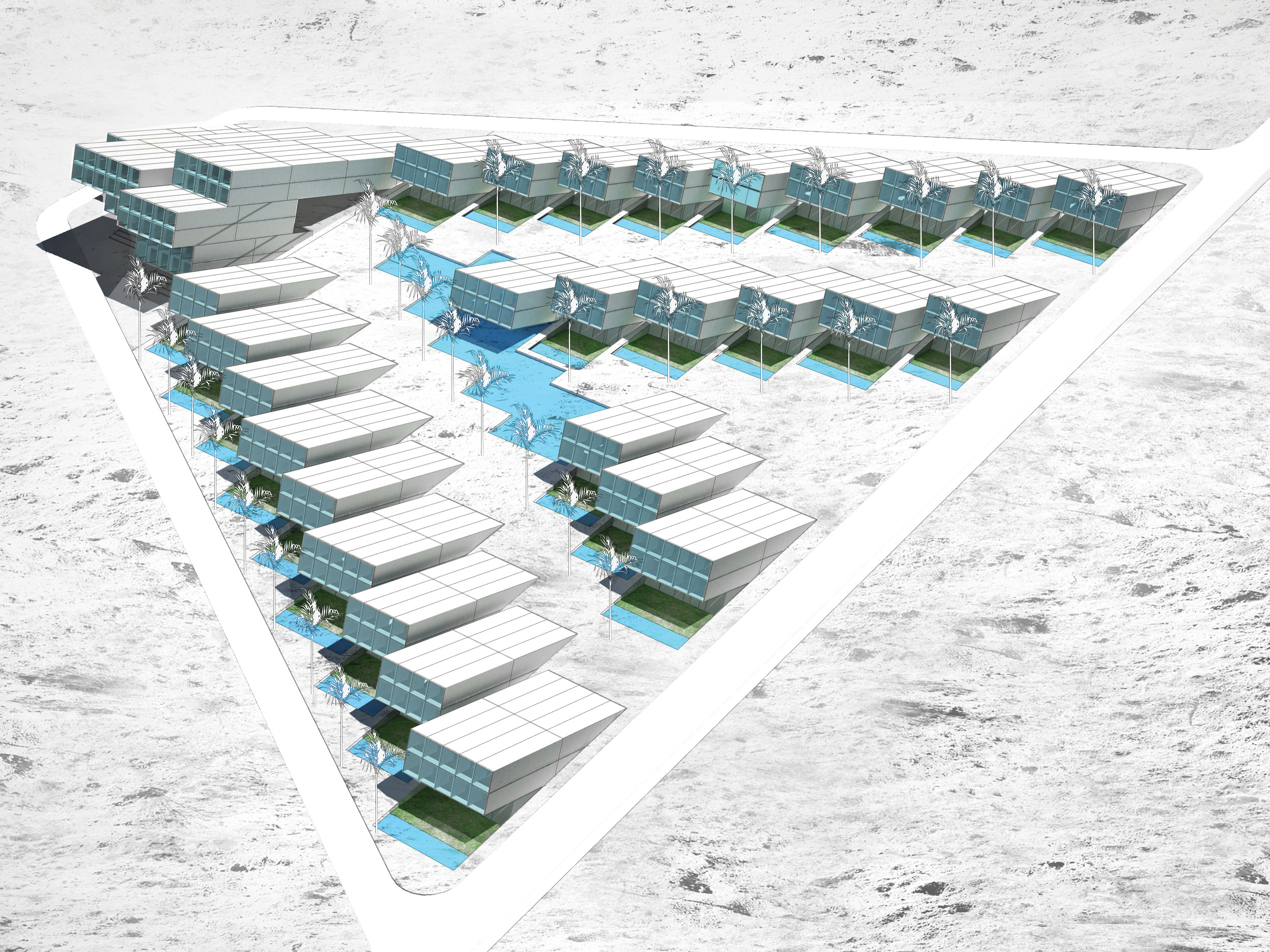
Type: Single-Family Residences and Community Center
Location: Palm Spring, CA
Size: 200,000 SF lot (98,000 SF Residential + 33,000 SF Healing/Meditation Center)
Design: 2010
Project Architect: Virginie Stolz
Structure: Silman
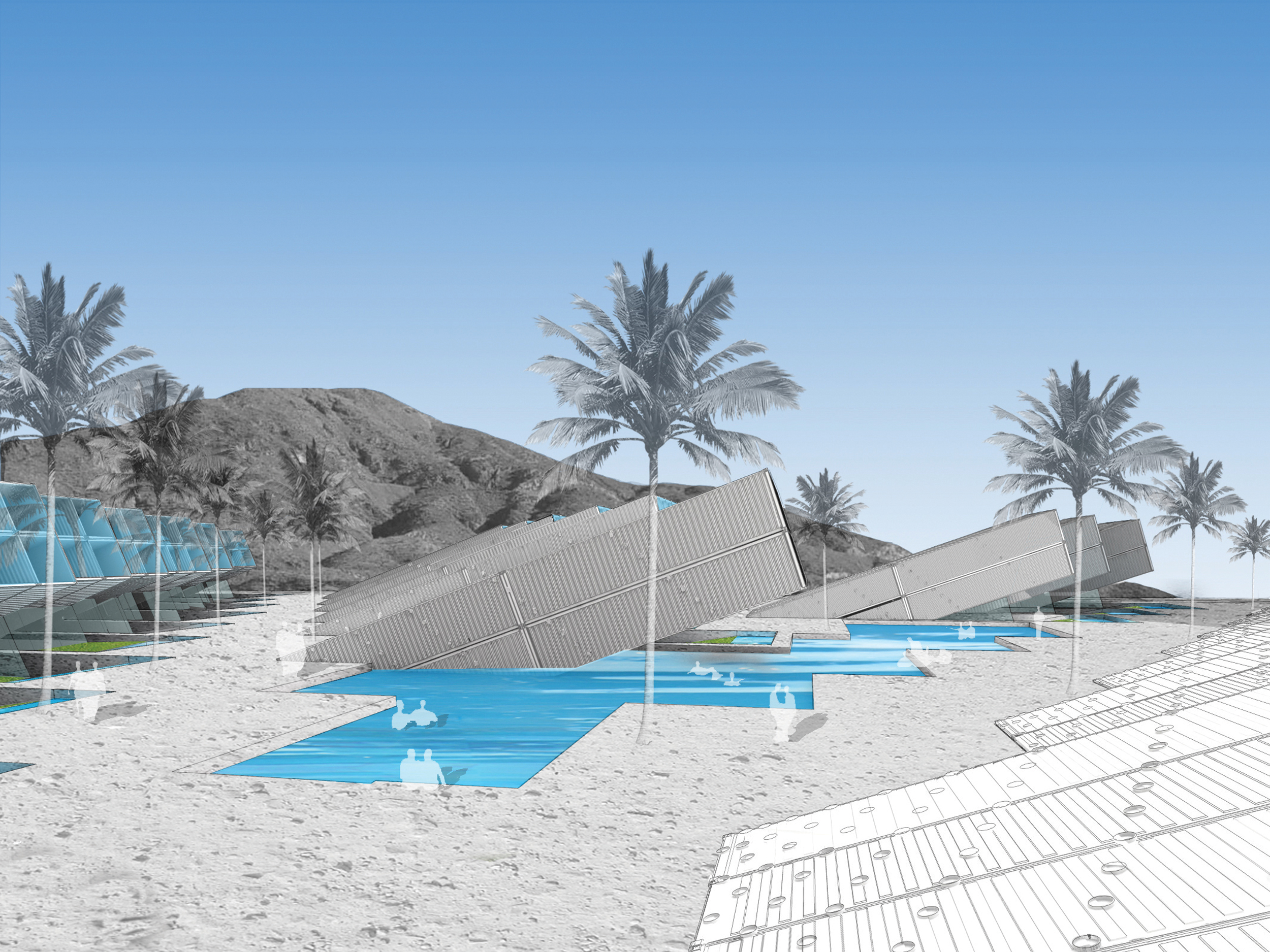
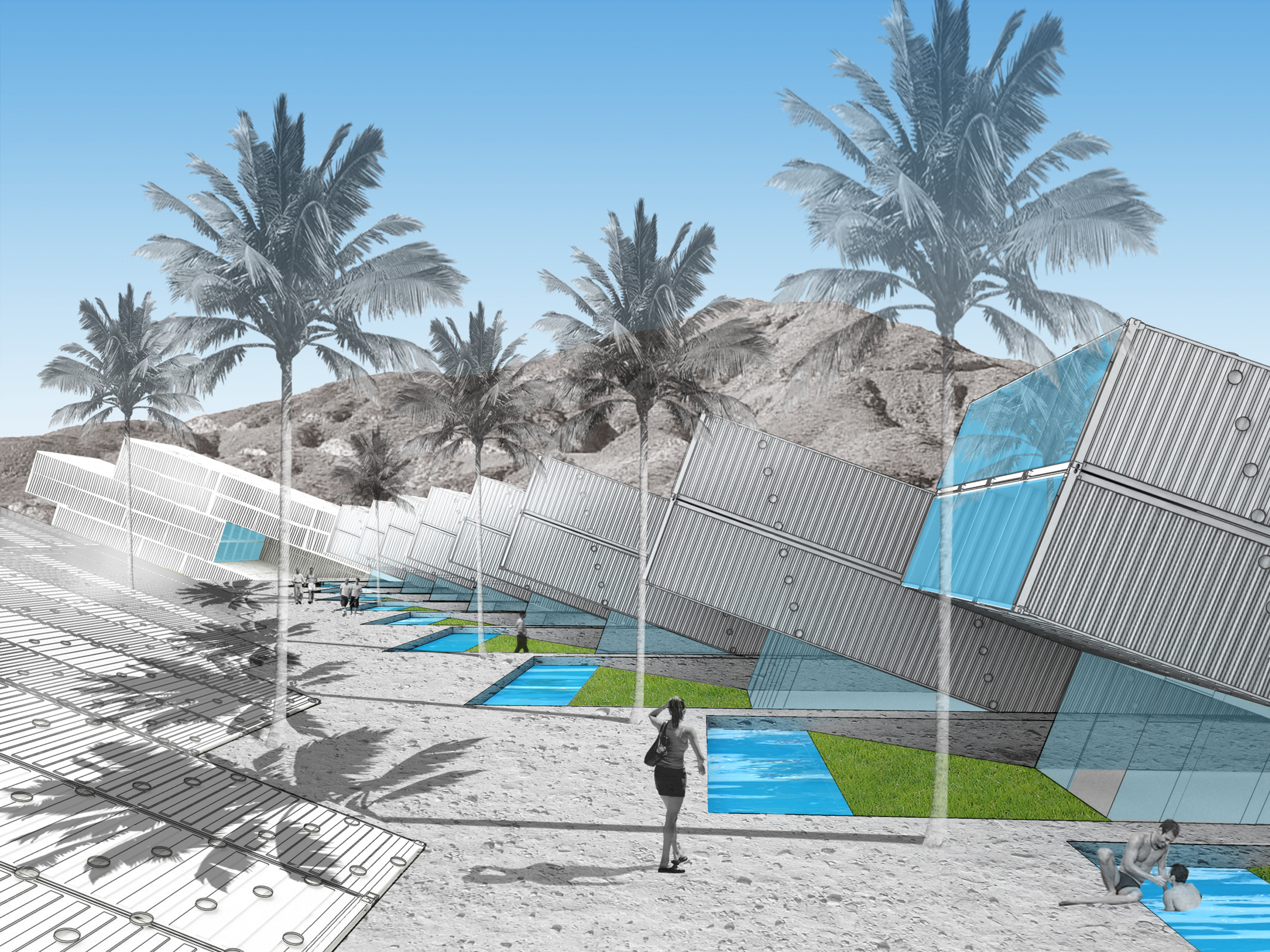
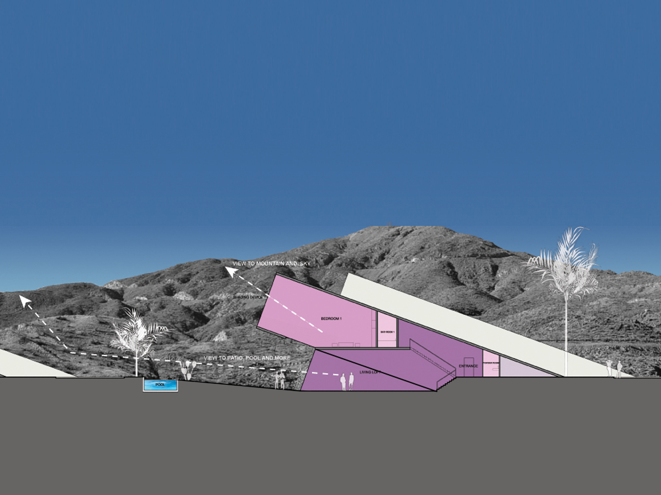
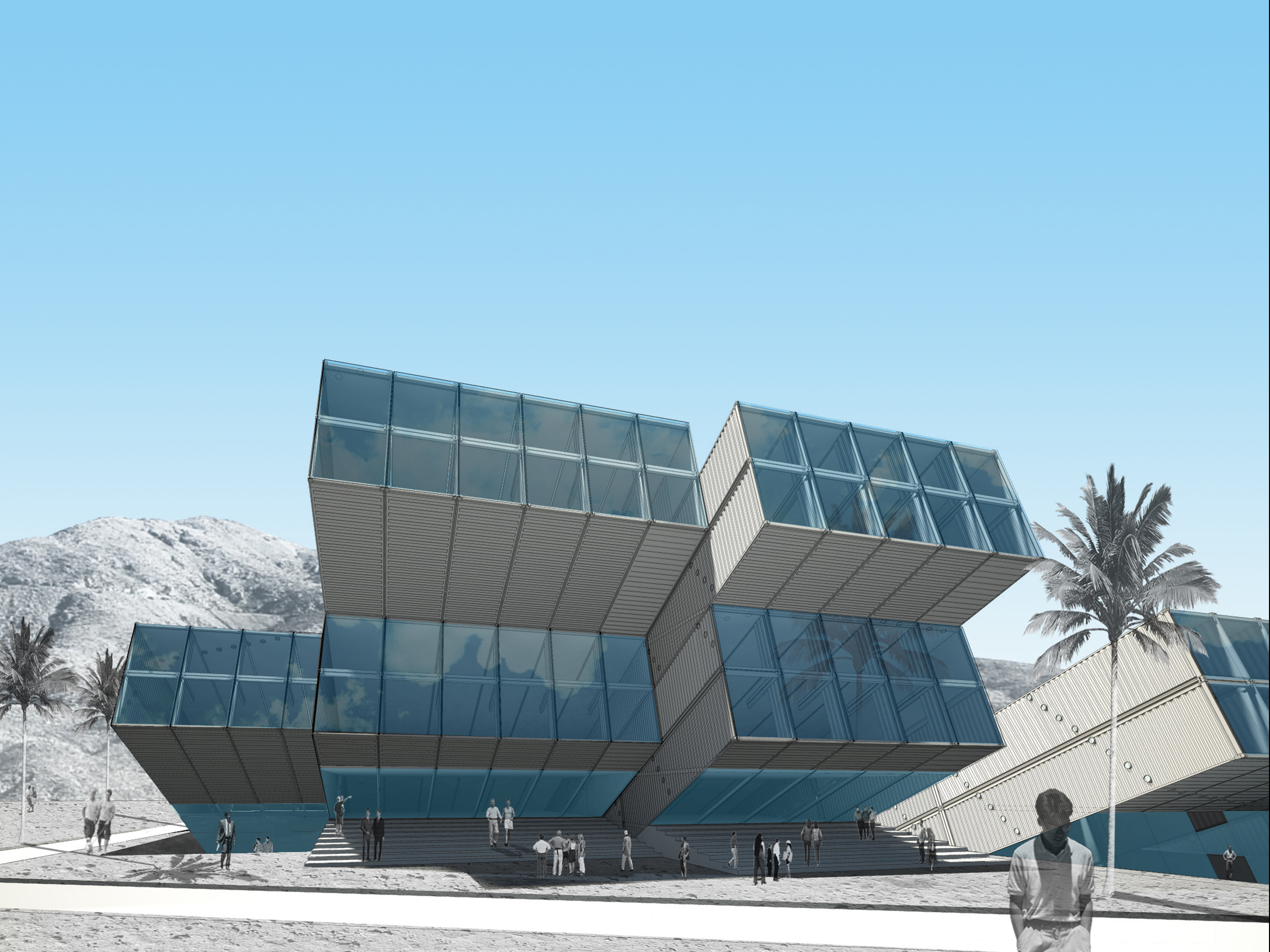
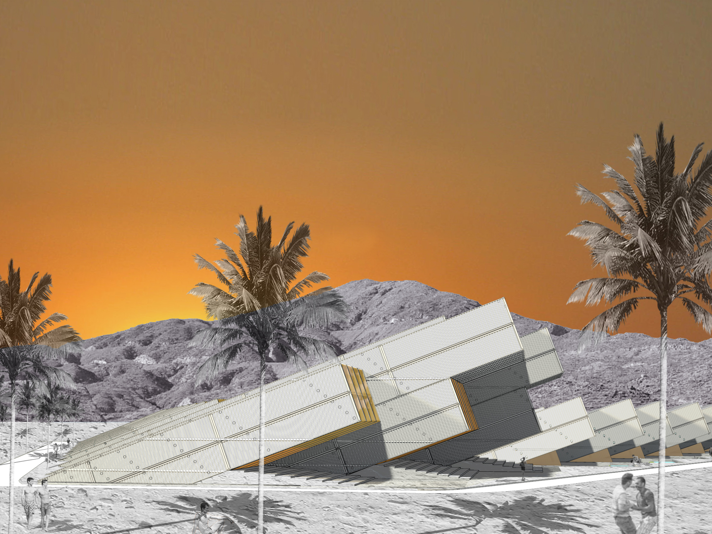
Our concept for a residential community is inspired by the extraordinarily sculptural presence of slanted rock formations in the American desert. We have interpreted this slanted geometry to generate a massing that organically emerges out of the desert soil: a quasi-natural environment characterized by sculptural volumes and striking shadow patterns. Each home contains the garage at grade, a sunken living room and upper floor bedrooms. The large living room is an open, loft-like area, with double-height ceiling. An interior stair leads to upper bedrooms, an open kitchen and a vast glass wall that allows visual and physical continuity with the patio/pool. The upper bedroom suites are also loft-like, with high slanted ceilings and large windows providing sweeping mountain views. The private patio is visually connected to the neighboring homes. Its slightly slanted/sunken floor provides discrete separation from the surrounding environment. We imagine this patio to be a green and shaded oasis, a lush respite from the hot, dry desert.
The Boom Community Center is a facility dedicated to a range of social activities for community residents. It will contain an alternative spa, for the provision of healing practices such as Ayurvedic medicine, acupuncture, massages, therapeutic mud baths, etc. In addition, the center will provide a peaceful mind/body studio for residents interested in studying and practicing activities like meditation and yoga. Similarly to the houses, the healing center is centered on the same motif of slanted volumes on a slightly larger scale. These volumes create a sculptural edge on the southern end of the central plaza, and at the same time act as a privacy filter for the residential area. The interior of the healing center is characterized by open spaces with high ceilings and large window/skylights with views towards the sky and the mountains. The skin of the volume is also perforated with a pattern of holes that regulate soft light penetration from sides, top and bottom throughout the building.


ASCENSORES VALPARAISO
Comission: SCL2110, Santiago Biennial 2010
Artistic Director: Rodrigo Tisi
Location: Valparaiso, Santiago, Chile
Design: 2010
Project Architect: Gia Wolff
The Ascensores Valparaiso proposal envisions a new use of the existing funicular system in which the axis of the various cable cars are extended to reconnect the higher informal city of the ‘cerros’ (hilltops) to the lower formal city and to the water. Each extended line is then expanded in order to outline different proposed activity zones that develop out from the funicular axis to engage the larger urban territory.
The project operates at several different levels - urban planning and zoning, architecture, industrial design, graphics and mapping. The different modes are interconnected and have been developed as such, moving continuously through the different scales and linking approaches and strategies in a conceptually energetic manner.
The final project reflects these multiple aspects - consolidating the urban re-planning of the existing funiculars throughout the city, to the midscale of the proposed reactivation of the Espiritu Santo axis as a sort of infrastructural 3D zoning, to the intervention on the cubicle of the cable car itself, to the production of a AscensoresValparaiso’s map - not unlike the subway/underground maps of a large metropolis.
The proposal is framed within a larger ambition for reimagining the city of Valparaiso, which until the 1914 opening of the Panama Canal was the most important port on the South Pacific coast. The new infrastructure responds to the current post-earthquake status with a significant revitalization plan that, starting from the very particular existing network of funiculars, aims at a larger urban regeneration through the injection of new activities, new energy, storm-water management and an integrated circulation to favor public space and a new pedestrian experience.
Step 1: the MAP
The design of the AscensoresValparaiso’s map (AV_map) is both a productive reading of the existing funicular infrastructure as well as a tool for the city and its development – for residents, students and tourists alike.
Each existing cable car is recorded and color-coded, its axis stretched out in two directions to reach both the hilltop informal developments above and the water below – now inaccesible because of the industrial port. The AV_map back shows the colored funicular lines and their intersection with existing relevant public functions within the city.
Step 2: the VISION
The colored lines – no longer only a graphic tool – are axes that cross the complex city topography as an infrastructure of light, energy, water management and circulation for a new city experience.
Step 3: the LINES
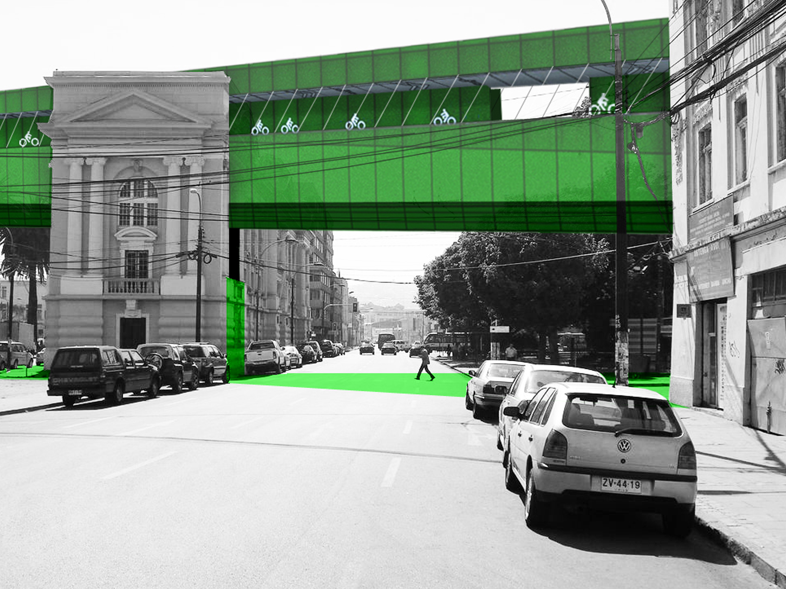
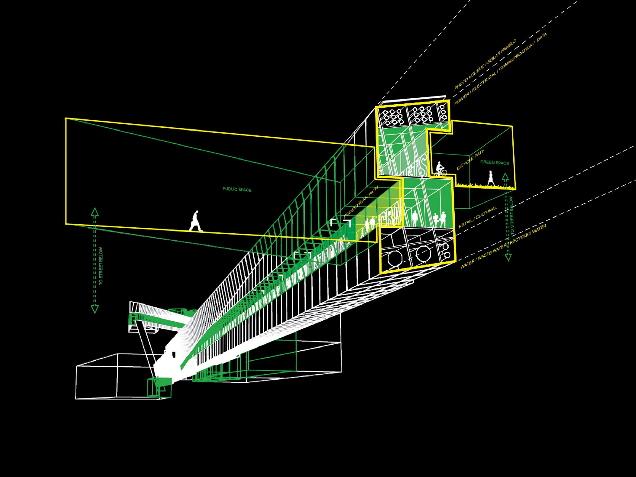
The colored lines are made up of a combination of: pedestrian circulation, bikes, skates and wheelchairs’ paths, collection and drainage of storm water from the hilltops, and solar-powered lighting throughout. They engage the juxtaposition in the urban fabric, intertwining and interacting with the administrative monumental city on the flat land as well as with the pixelated small-scale dense inhabitation that covers the hills.
Step 4: the FIELDS
The color lines expand to become color fields. New programs are inserted in and overlayed on the existing urban fabric. The adjacency between the old and new creates opportunities for a new experience of Valparaiso. As extensions of the existing ascensores’ infrastructure, which was widely distributed on the city terrain in the early 1900 to mitigate its steep topography, the fields propose a way to reactivate the ascensores with a new purpose beyond transportation.
Step 5: the ASCENSOR ESPIRITU SANTO
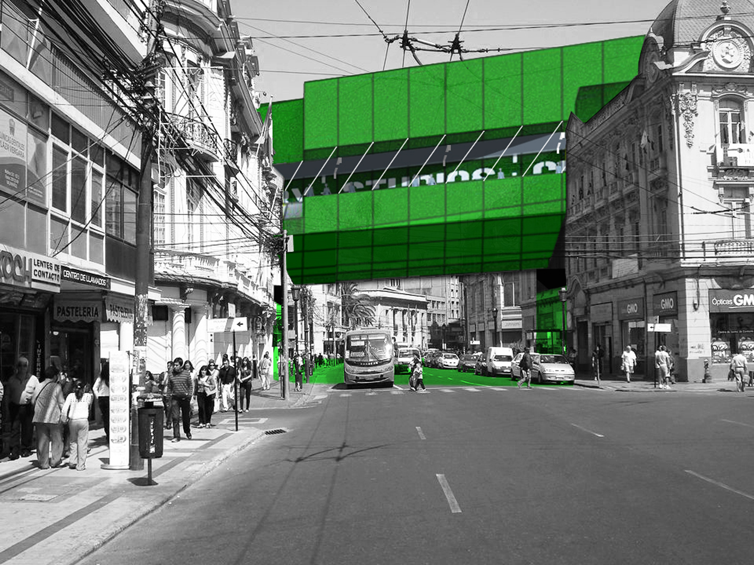
The funicular Espiritu Santo was selected for its central location to test the interaction of the proposal with a selection of the existing public spaces and buildings within Valparaiso, such as Plaza Victoria, the Santiago Library and the La Sebastiana Museum.
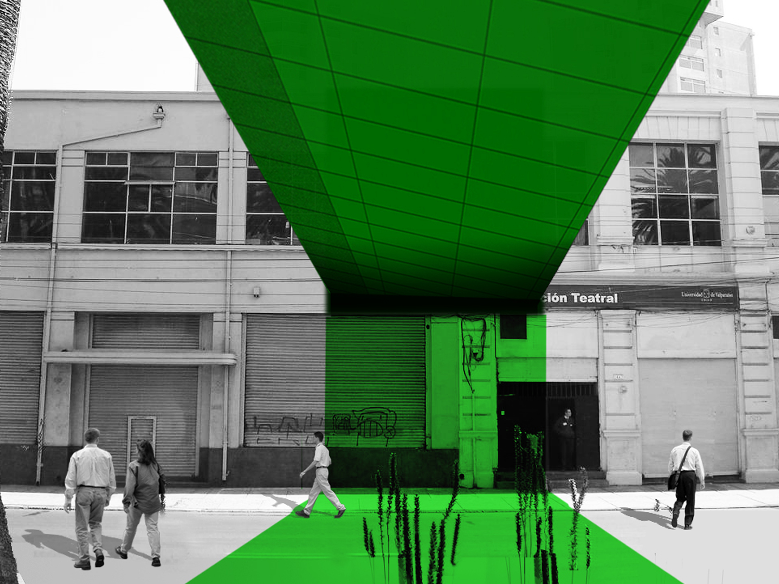
The green axis of the funicular has been extruded into a physical linear volume that crosses the city, its open spaces and its built fabric adjusting to different heights at different points. Along this volume, retail and culture fill the space contained between the pedestrian and bike paths. The moments of intersection with the existing buildings are reconfigured as new public spaces, generating opportunities for program exchange as well as vertical circulation to link the elevated public space to the city at ground level.
The ascensor is a switch point along the color field. As both the generator and the glitch within the inhabitable map, the two up-and-down ascensor cabins are conceived as a single box split in two, with the split faces being the only glazed façades skinning an otherwise mute box. Refocusing the experience of the ride from the mere view of the panorama toward the encounter with the car’s opposite half – which happens only once at the mid-point of the climb - the ascensor’s journey is centered on the people’s face-to-face interaction (and its expectation) as they go up or down along the track experiencing this ingenious early engineering industrial infrastructure.
The two terminal ends of the Espiritu Santo green band are look-out points as well as physical connections and access points to the city. On the hills, the view is toward the areas of continuous expansion of the city and the adjacent cerros. At the water, the connection is with the waterfront – currently severed by the left-over fabric of the industrial port – and the openness of the Pacific Ocean.
Learn more:

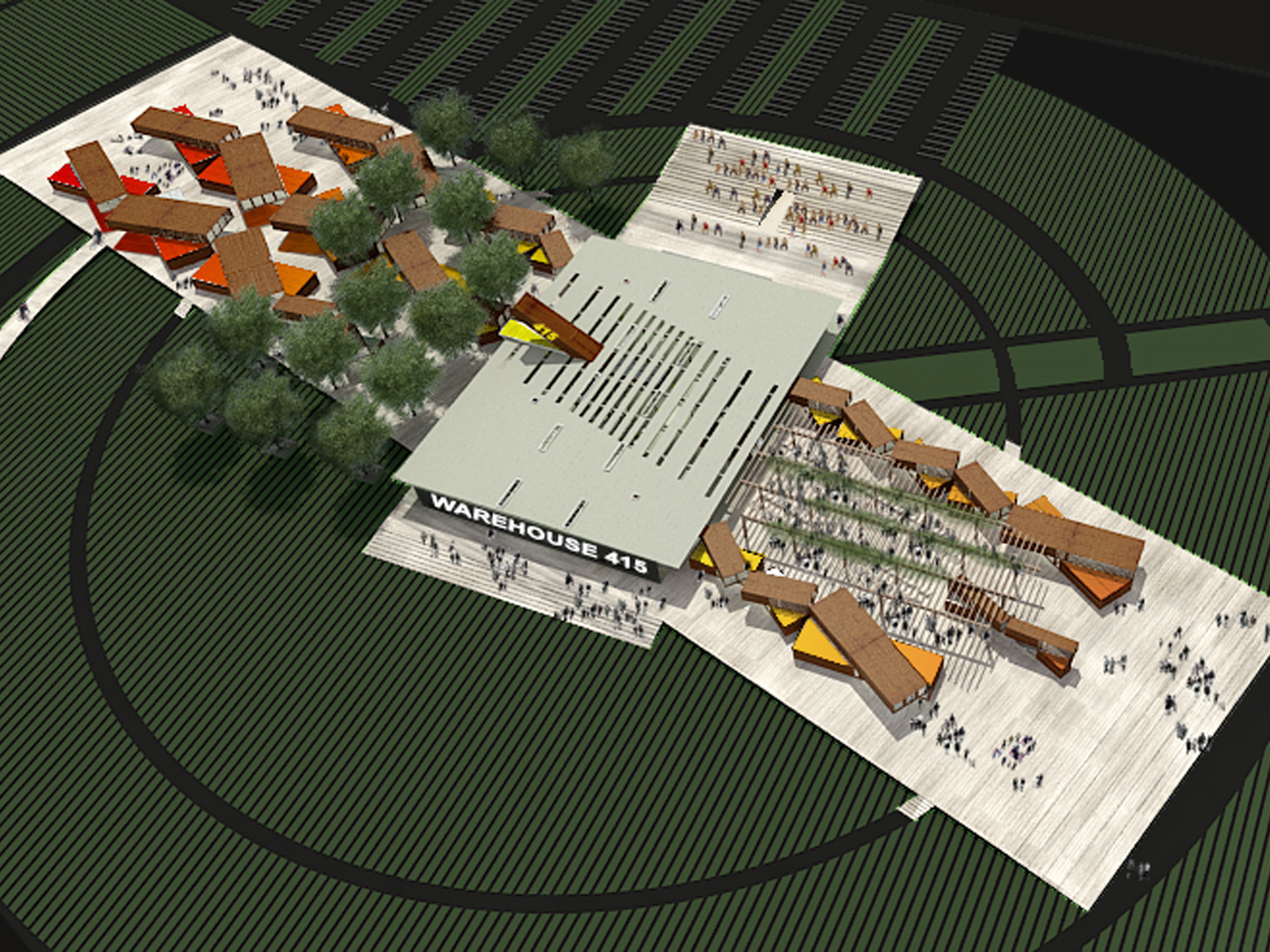


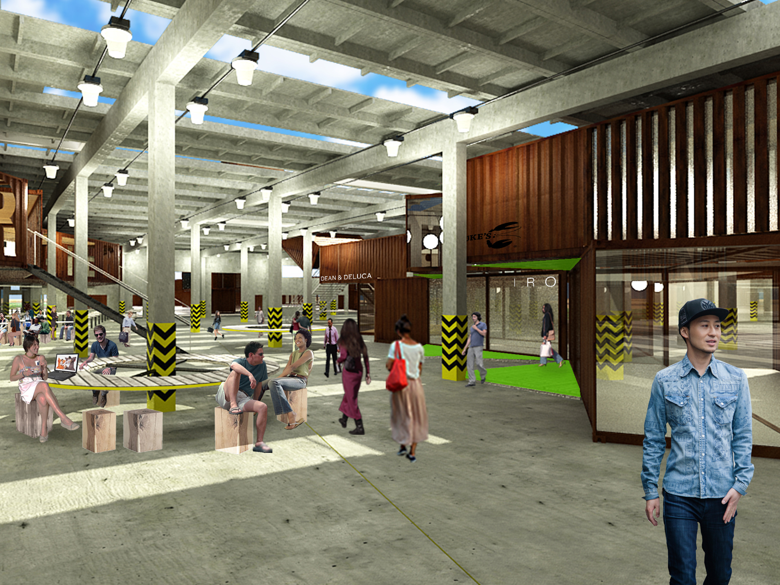

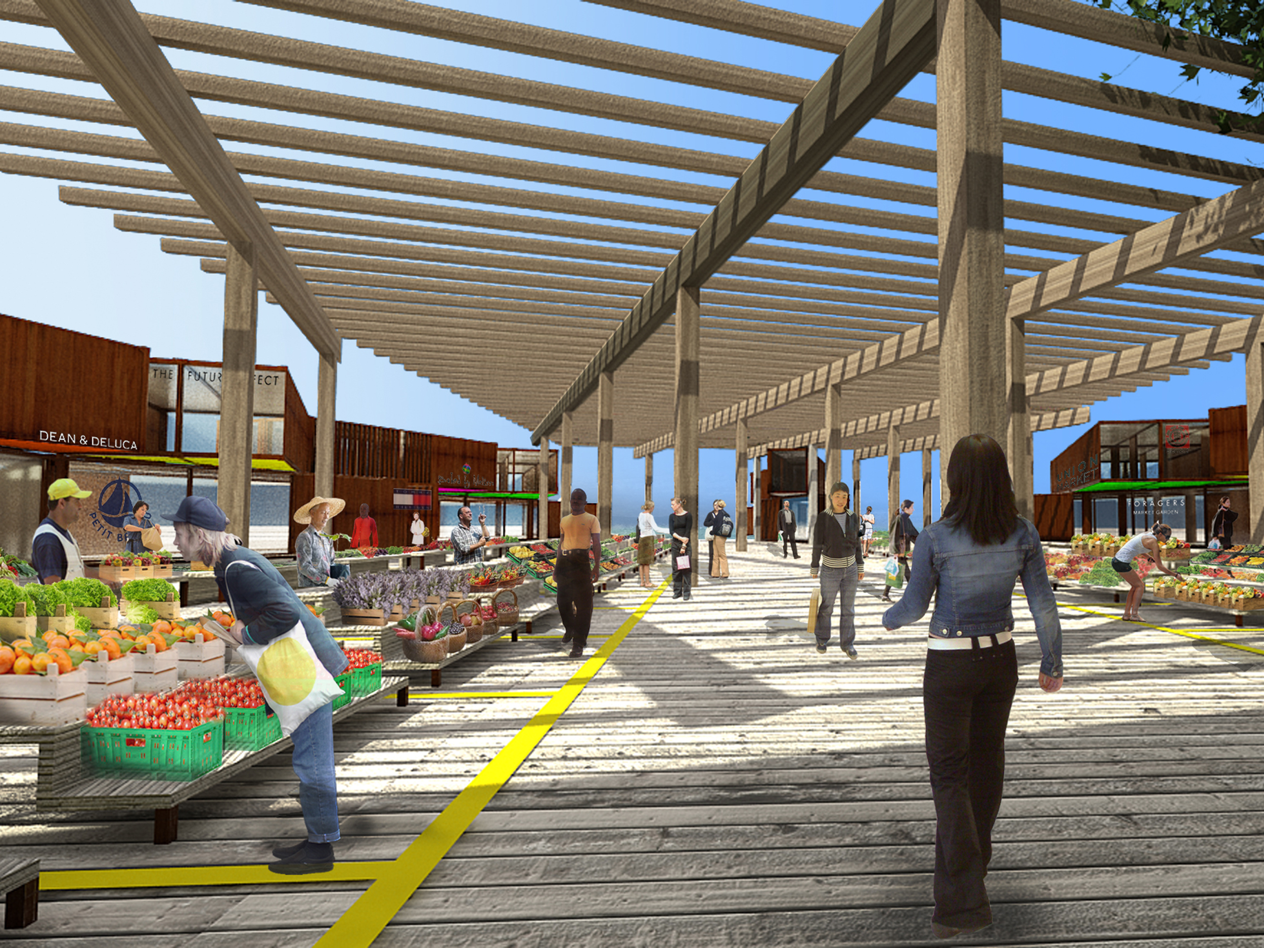

WAREHOUSE 415 RETAIL CENTER
Type: Retail/Commercial/Leisure
Client: Undisclosed
Location: Irvine, CA
Size: 95,000 sqft indoor+ 22 acres outdoor
Design: 2013
Project Architect: Virginie Stolz
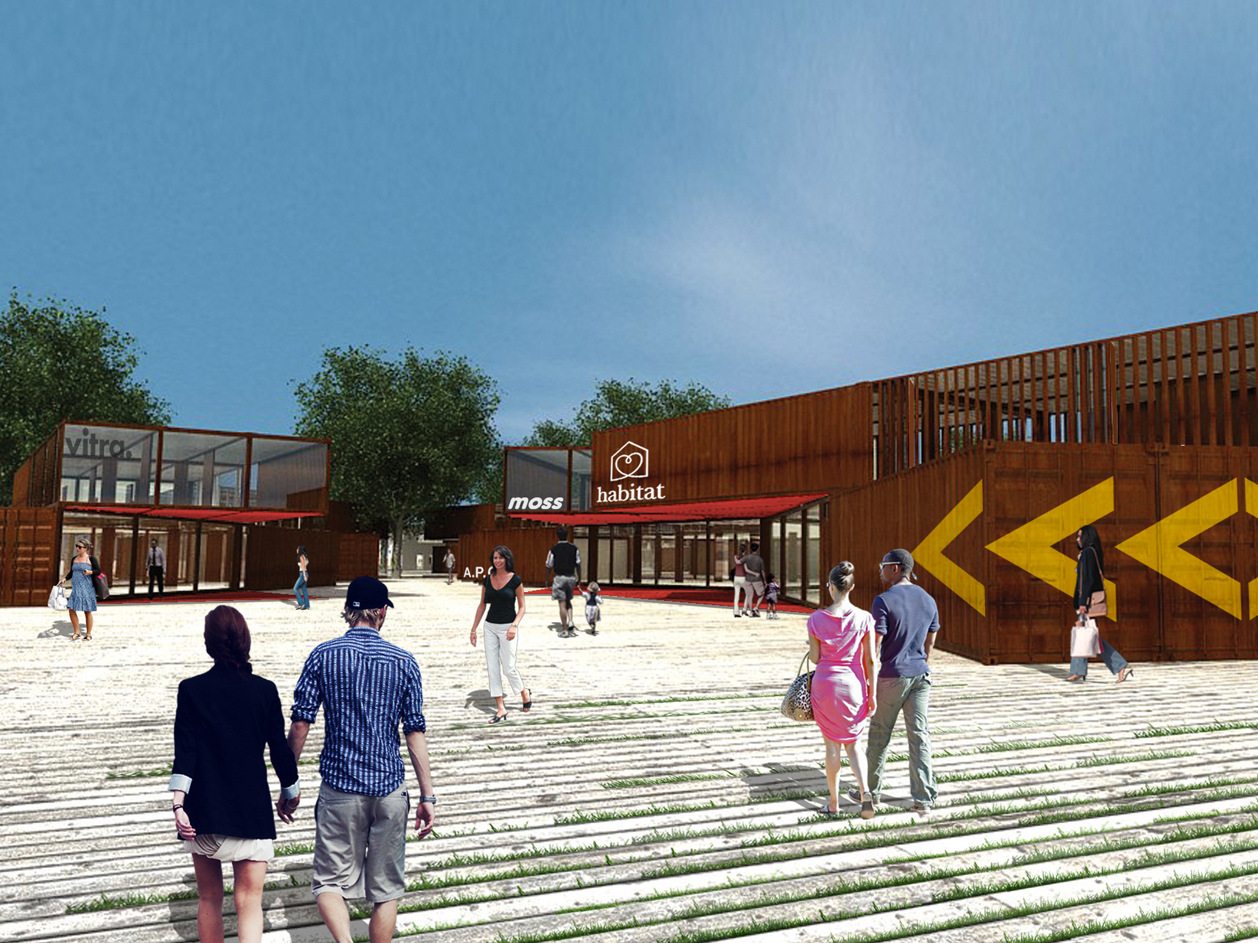
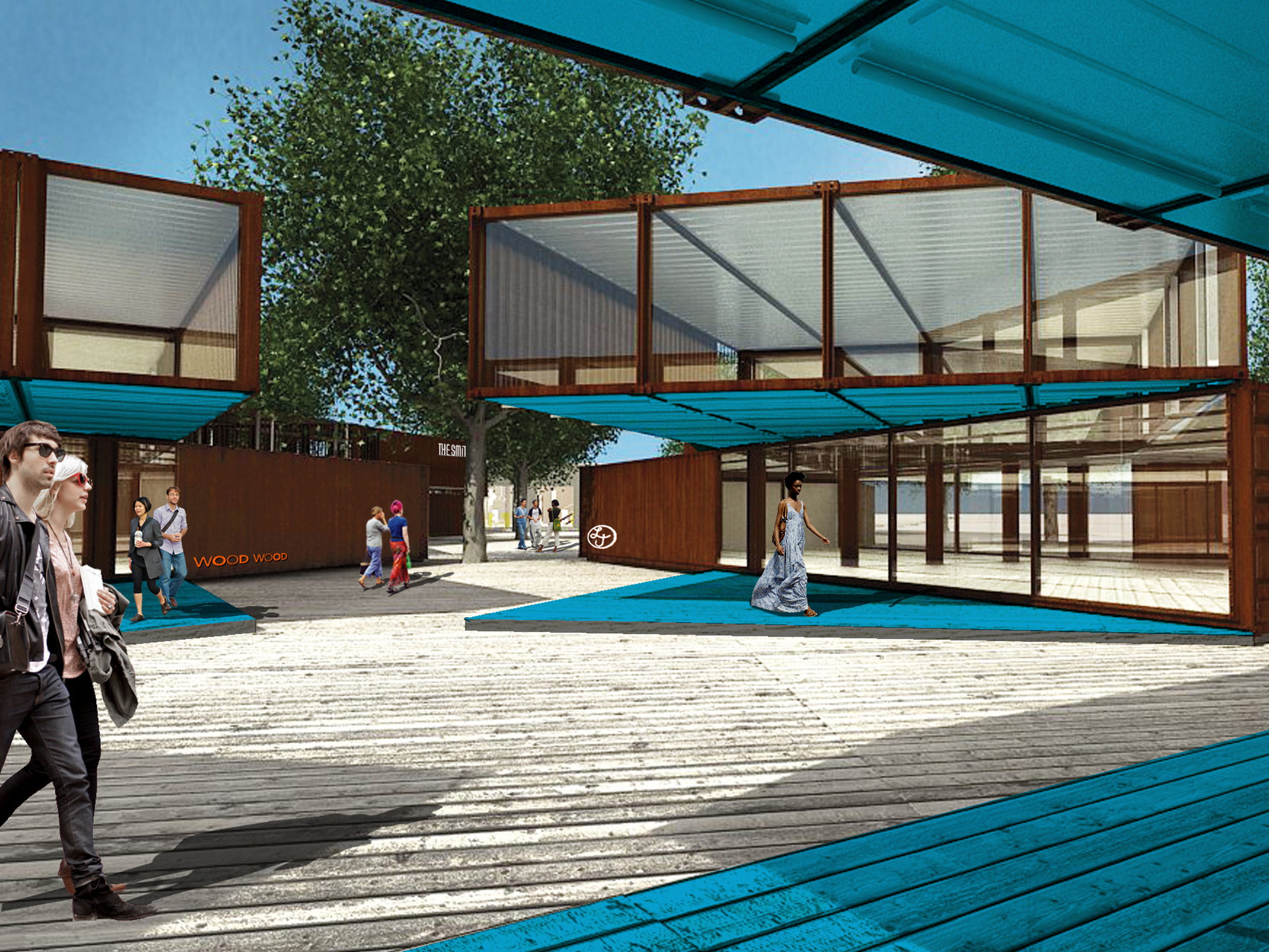
We were commissioned to create an attractive, vibrant and contemporary retail/leisure area, centered around an existing warehouse structure. Opposite of the typical strip mall development, the client’s goal is to attract a consumer who appreciates and desires a more dynamic and specific retail experience, anchored by a brewery/restaurant, a marketplace for local produce and food vendors, as well as an outdoor community amphitheater. The scheme is based on a skewed cross-like shape which responds to the scale of the planned neighborhood: one arm is dedicated to retail and is oriented along the East-West axis, while the other is dedicated to entertainment along the North-South axis. The cross is surrounded by an agricultural preserve along Irvine Boulevard, and extends directly into the planned residential area. The main entrance and parking will be placed at the easternmost end of the cross.
The volume of a single retail unit is generated by stacking 2 layers of containers, and rotating/shifting the upper layer. This move creates a very dynamic, multifaceted volume, resulting with large overhangs that create elegant canopies and shading for the retail shops. The rotation of the 2 levels also provides an interesting way of physically and visually
connecting the retail units to each other, forming what essentially becomes a “braid” of retail. This makes the resulting open space very interesting to the eye, offering intriguing and surprising moments for visitors. The retail units are fabricated entirely of used shipping containers that have been sandblasted to uncover the organic patina of the oxidized corten steel. Gradient colors are painted under the cantilevers and the corresponding pavings to accentuate these canopied spaces. The colors are used as a contrasting accent to the natural corten steel, while also providing visual variety along the paths.
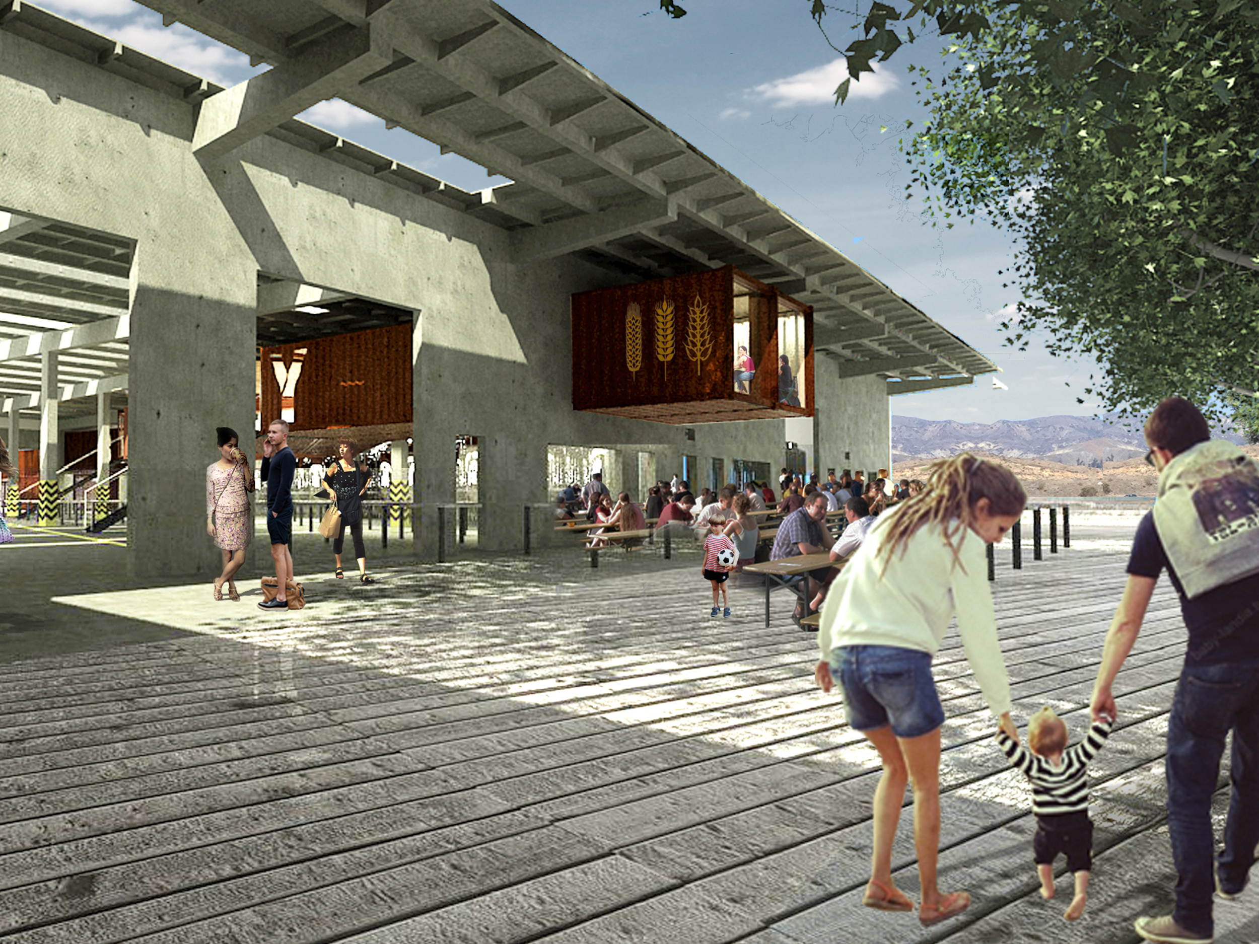
Once visitors arrive at the Warehouse, they find themselves in a large open space centered around a communal dining atrium with a water feature. Openings in the ceiling allow natural light to filter into the otherwise dark and cavernous room. The northern portion of the warehouse is designed to house the new 12,000 SQFT brewery/bar/restaurant. The container aspect continues into the warehouse, as a design and functional element: a single sculptural layer serves as a mezzanine area of the brewery. Cutouts in the floating containers offer diners views over the main dining atrium. Glassed-in brewery tanks are designed to be visible from every vantage point in the atrium.
The western exit from the warehouse leads to an outdoor shaded marketplace, while to the south of the Warehouse, the boardwalk ascends to generate seating for a large-scale open-air amphitheater. The area offers a perfect venue for all types of large community and/or family events, from live theater to music concerts, storytelling for children. Additionally, the south warehouse facade would incorporate a large screen to support the projection of evening movies and/or shows. The large amphitheater will have direct access to and from the adjacent parking lot to manage flow of crowds for big events.